Preview image. Unlock full-res
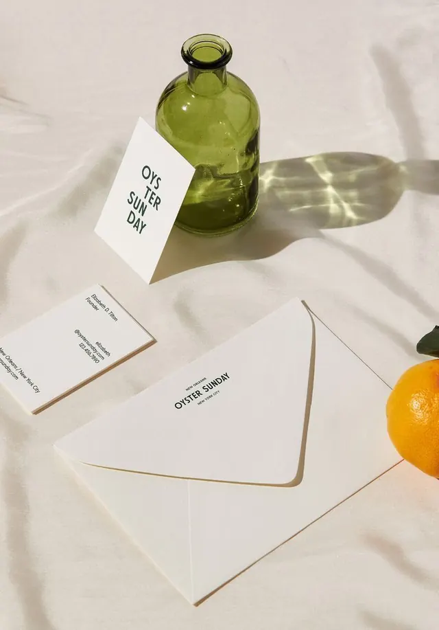
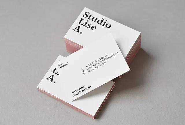
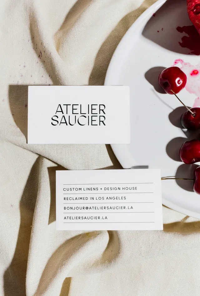
A minimalist branding still shows two white business cards on cream fabric beside a white plate and red cherries.
Summary
A minimalist branding still shows two white business cards on cream fabric beside a white plate and red cherries.
Visual description
Two white business cards are arranged on textured cream cloth, with one card showing a centered stacked wordmark and the other showing several lines of contact information. A white plate intrudes from the right edge and holds glossy red cherries with scattered juice stains and strong directional shadows.
Key takeaway
Use simple white stationery against tactile natural materials to make the typography and object styling feel elevated. Strong side lighting and a few saturated accent objects can create a premium still-life composition without adding visual clutter.
Reuse notes
Reach for this when presenting a brand identity, stationery system, or a refined print-focused aesthetic. It works best when the goal is to make minimal typography feel luxurious through material contrast and photography.