Preview image. Unlock full-res
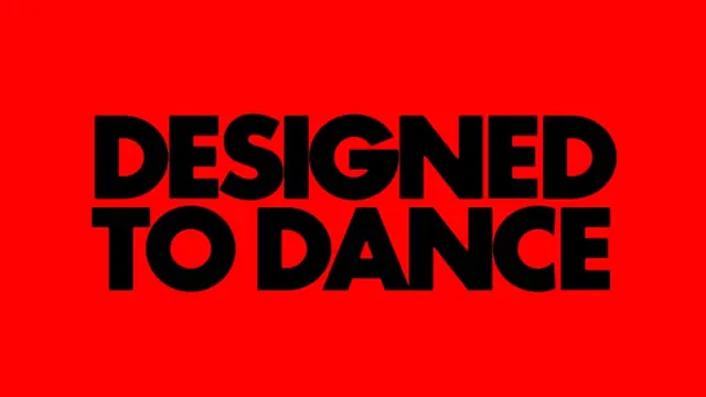
A high-impact type slide setting the heavy black all-caps phrase DESIGNED TO DANCE across two lines on a saturated red field, with no other elements.
Summary
A single phrase carries the whole frame: DESIGNED TO DANCE set in a heavy black all-caps grotesque across two centered lines on a flat, saturated red ground, with nothing else competing.
Visual description
The canvas is one flat vivid red. Centered type fills most of the width in two stacked lines, DESIGNED TO over DANCE, set in an ultra-bold rounded-terminal sans-serif in pure black. Letters are tightly tracked and the two lines are packed with minimal leading so the words read as one solid mass. The counters of the round letters (D, O, A) become small red shapes inside the black, the only negative space. No imagery, rule, or secondary text appears.
Key takeaway
Letting one short phrase in a maximally heavy weight be the entire composition, so the message lands instantly. The black-on-red pairing plus tight tracking turns flat type into a near-logo. Packing two lines with almost no leading makes the words read as a single block rather than a sentence.
Reuse notes
Ideal for an event title card, a campaign opener, a slide divider, or merch where one line has to dominate. Swap the phrase and you have a reusable statement template. Keep the palette to two flat colors and the weight maximal, any lighter and the punch is lost. Red on black is intense, so use it as a moment, not a body-copy background.
More like this
Keep what you find
A free account saves references to boards and can send you a weekly email of picks based on what you save.
To see every result, go Pro.