Preview image. Unlock full-res
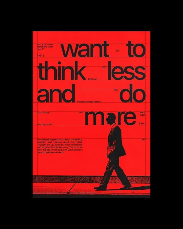
A red poster where the black headline 'want to think less and do more' interlocks with a halftone silhouette of a walking man and grid-pinned annotation notes.
Summary
A two-color red-and-black poster whose oversized black headline "want to think less and do more" is broken across a faint grid and tangled with the halftone silhouette of a man mid-stride.
Visual description
The artwork is bordered in flat black framing a saturated red field. A heavy black sans-serif headline fills the upper two-thirds in five word-lines, slightly condensed and tight-leaded. Faint horizontal grid rules and small numbered callouts "(01)" through "(05)" sit beside the lines like editorial annotations, with whispered side-notes ("blockvoid", "best day to start", "read it again", "2024 - today"). A short paragraph of body copy anchors the lower-left. Cutting through the bottom half is a grainy, high-contrast halftone silhouette of a suited man walking right, casting a long shadow across a textured ground band. Everything is black on red except the printed-paper grain.
Key takeaway
Letting a photographic silhouette and the type occupy the same plane so the figure reads as both image and texture. Dressing a motivational headline in numbered grid annotations to make it feel like a system rather than a slogan. Strict two-color economy with halftone grain doing the tonal work.
Reuse notes
Good reference for a punchy editorial or agency poster, social hero, or zine cover that needs energy on a budget palette. The annotation layer adds depth but can clutter at small sizes, reserve it for print or large screens. Duotone halftone keeps it cheap to print and instantly bold.
More like this


Keep what you find
A free account saves references to boards and can send you a weekly email of picks based on what you save.
To see every result, go Pro.