Preview image. Unlock full-res
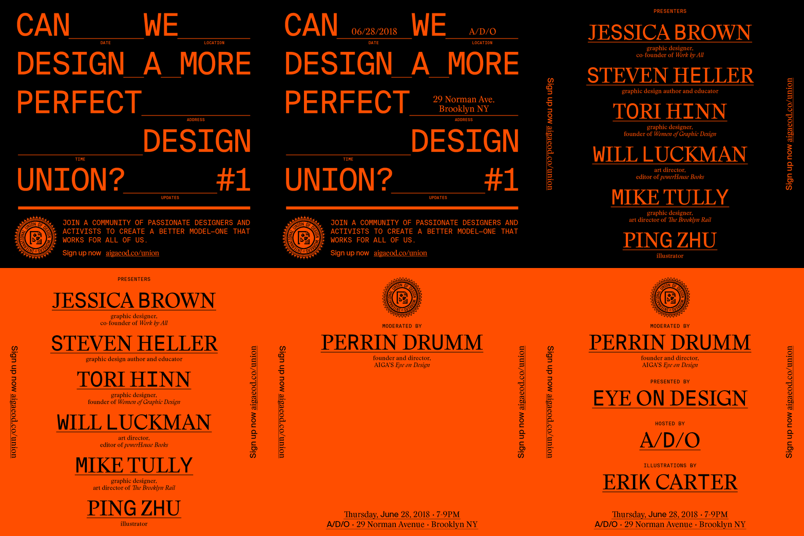
An orange-on-black activist poster that fills five lines of oversized condensed caps with the question 'Can we design a more perfect design union?', the gaps doubling as labeled fill-in-the-blank form fields.
Summary
A bright-orange-on-black poster whose oversized caps headline runs across five full-width lines, and whose word gaps are drawn as ruled blank lines tagged DATE, LOCATION, ADDRESS, TIME, UPDATES, so the headline literally becomes an enrollment form.
Visual description
Everything is one saturated orange on solid black. A tall condensed sans in all caps sets the question across five justified lines, the type so large each line nearly spans the canvas. Between and after words, thin horizontal rules fill the leftover space, each annotated underneath with a small monospace-style label, mimicking a paper sign-up sheet. A long horizontal rule separates the headline from a footer: a circular engraved union seal reading "International Union of Design Workers" sits lower-left beside a two-line body sentence and a "Sign up now" link in caps. The composition is dense, edge-to-edge, with almost no margin.
Key takeaway
Treating the empty space inside a headline as functional form fields, complete with ruled lines and field labels, fuses message and call-to-action into a single typographic object. The mono labels under the rules add a bureaucratic, official texture that reinforces the "union" theme.
Reuse notes
Reach for this when a poster needs to feel like a document or petition, for organizing, manifestos, event sign-ups. The two-color orange/black system is cheap to print and screams urgency. The trick depends on a condensed face that can go very large and stay legible; a wide typeface would not justify across the line the same way. </content>
More like this

Keep what you find
A free account saves references to boards and can send you a weekly email of picks based on what you save.
To see every result, go Pro.