Preview image. Unlock full-res
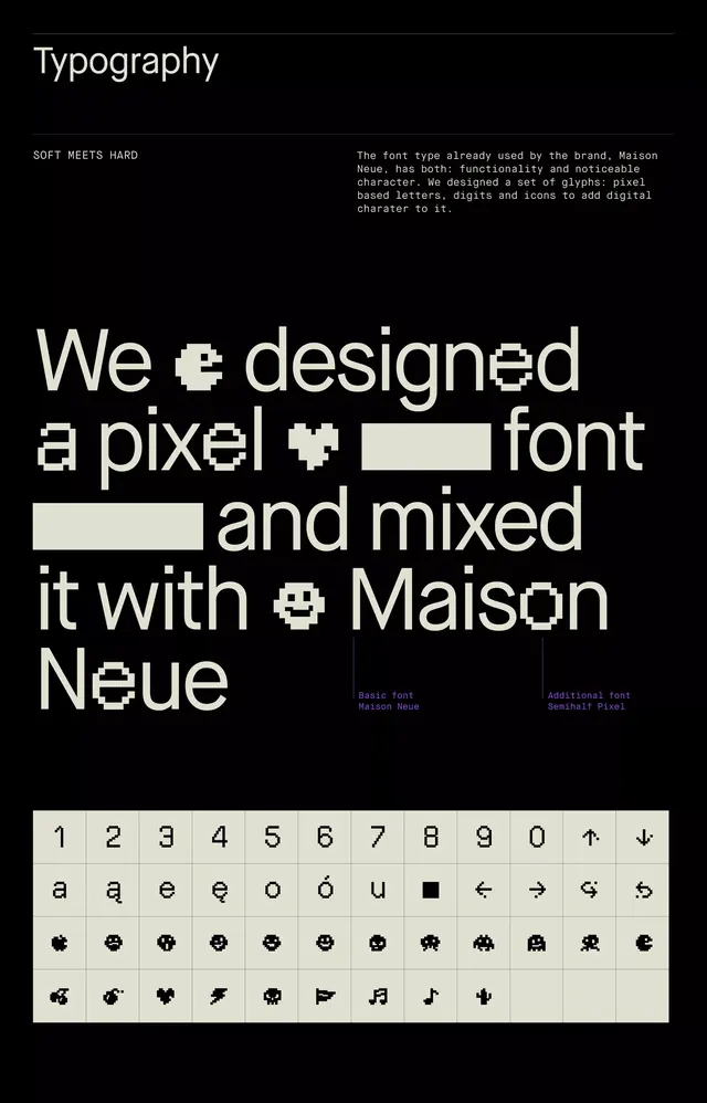
Dark brand-guideline typography page that mixes an oversized cream sans-serif headline with custom pixel-art glyphs and closes with a four-row reference grid of digits, letters and pixel icons.
Summary
A brand-guideline typography page that pairs a clean cream sans-serif with custom pixel-art glyphs, the two faces swapped letter for letter inside one oversized headline, then catalogued in a glyph grid at the bottom.
Visual description
On a near-black field, a hairline rule and the small label "Typography" head the page. Below it a two-column intro sets "SOFT MEETS HARD" against a monospaced paragraph explaining the system. The centerpiece is a huge cream headline reading "We designed a pixel font and mixed it with Maison Neue," where individual letters are dropped out and replaced by blocky 8-bit glyphs, including a pacman-style dot-eater and a pixel heart, so the smooth sans and the pixel font interleave mid-word. Tiny purple captions tag the two faces, "Basic font Maison Neue" and "Additional font Semihalf Pixel." A four-row reference grid in an off-white panel closes the page: digits 1 to 0 with arrows, accented lowercase letters, then two rows of pixel emoticon and game-sprite icons (skulls, invaders, a flag, a cactus, music notes).
Key takeaway
The letter-for-letter swap that drops pixel glyphs into the middle of words set in a clean sans, so "soft meets hard" is demonstrated inside the headline rather than just stated. Also the closing glyph grid that documents the custom icon set as a proper specimen, giving the experiment a systematic, usable feel.
Reuse notes
Good for brand or type-system guideline pages, especially a tech or gaming identity that wants a digital, retro-arcade accent without abandoning a legible workhorse sans. The cream-on-black plus a single purple caption color keeps it controlled. Needs a genuinely complete custom glyph set or the swap looks like a one-off gimmick.
More like this








Keep what you find
A free account saves references to boards and can send you a weekly email of picks based on what you save.
To see every result, go Pro.