Preview image. Unlock full-res
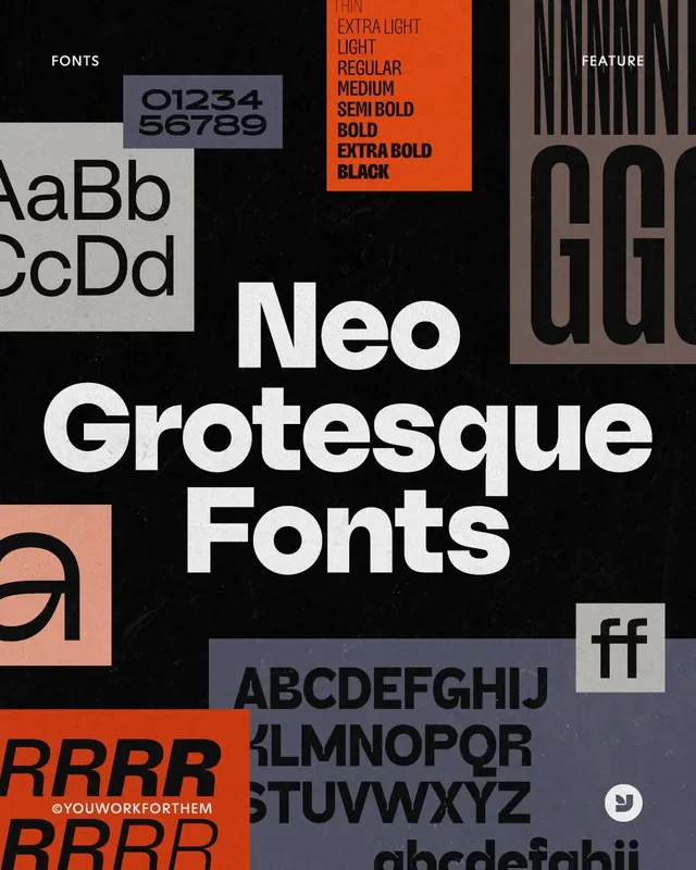
A type specimen for a sans-serif family shown across multiple weights, arranged with dramatic high-contrast colorblocks in orange, dusty blue, and warm beige against black.
Summary
A type specimen for a sans-serif family shown across multiple weights, arranged with dramatic high-contrast colorblocks in orange, dusty blue, and warm beige against black.
Visual description
The specimen demonstrates a heavy-weight neo-grotesque typeface family across nine weights (extra light through black) with sample characters in uppercase and lowercase. Chunky rectangles of burnt orange, dusty blue-gray, and warm taupe are scattered across a black background, creating a layered, overlapping composition. Each colored block contains different type samples, weights, or numeric specimens. A vertical column of text on the left reads "FONTS" in the typeface, and sections labeled "FEATURE" and metadata appear on the right. The layout deliberately fragments the page into asymmetrical zones, balancing dense type information with generous negative space and visual hierarchy through color contrast.
Key takeaway
The colorblock approach breaks up specimen monotony and emphasizes different weights visually. High saturation accent colors against black make each weight sample distinct and memorable. The asymmetrical grid layout feels contemporary and editorial, avoiding the rigid alignment typical of traditional type specimens. The condensed, heavy strokes of the sans-serif read as authoritative and modern even at small scale.
Reuse notes
Excellent for showcasing typeface families with multiple weights or styles. The scattered colorblock layout works well when you want to showcase versatility and contemporary branding sensibility. Best paired with products that benefit from a bold, technical identity (tech, design tools, media). The black background requires careful margin management if printed.
More like this


Keep what you find
A free account saves references to boards and can send you a weekly email of picks based on what you save.
To see every result, go Pro.