Preview image. Unlock full-res
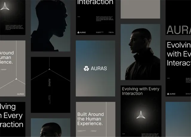
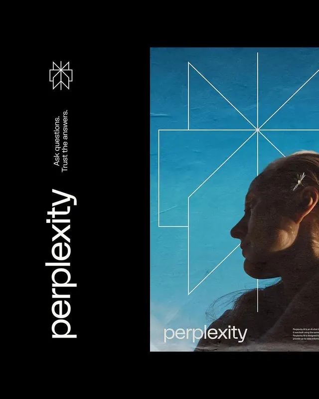
Auras brand identity system shown across a dark editorial layout combining profile silhouettes, geometric logotype, and high-contrast typography.
Summary
Auras brand identity system displayed across a multi-page editorial layout with dark backgrounds, silhouetted profiles, and geometric typography.
Visual description
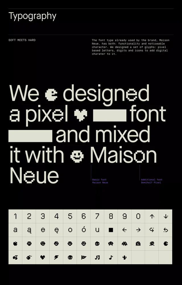
A multi-panel editorial spread on pure black backgrounds features silhouetted side profiles of a person in dark teal-gray tones, creating depth through backlighting contrast. The Auras logo (a three-pointed minimalist star) appears in white at multiple scales. White display-weight sans-serif headlines ("Evolving with Every Interaction," "Built Around the Human Experience") float in generous negative space above and below the silhouettes. A modular grid organizes panels of varying heights, with small body text in light gray providing context. Subtle geometric line work (a wireframe pyramid, directional vectors) grounds the conceptual framing. The entire palette stays within black, dark gray, white, and muted teal, maintaining severe visual discipline across spreads.
Key takeaway
The use of a stark dark background with single-color silhouettes (teal) creates psychological depth without complexity. The pairing of dense body copy with massive headline tracking (letterspacing) creates readable hierarchy at great distances. The modular grid allows varied visual weights while staying cohesive—a strong model for multi-page or multi-section systems.
Reuse notes
Ideal for B2B or creative agency identity systems, especially tech/software brands. The dark palette and serious geometric language suit professional audiences. The silhouette technique works well for human-centered products. Requires quality photography or illustration to sustain the visual weight; do not pair with stock imagery.
More like this





Keep what you find
A free account saves references to boards and can send you a weekly email of picks based on what you save.
To see every result, go Pro.