Preview image. Unlock full-res
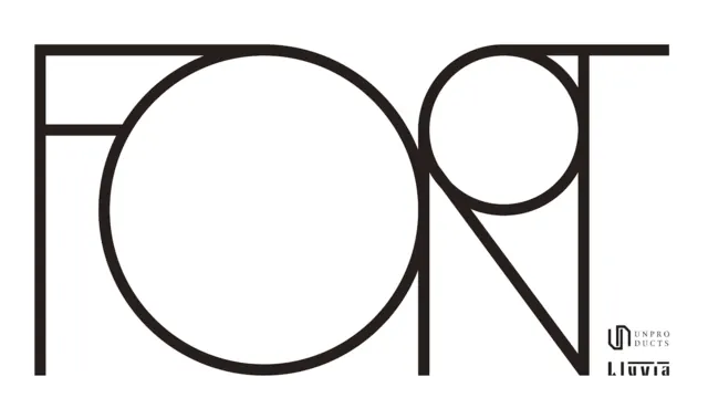
The word FONT drawn as oversized outlined letterforms built from perfect circles and straight lines on white, an art-deco-leaning monoline display alphabet with two small wordmarks in the corner.
Summary
The word "FONT" rendered as a single oversized line drawing where the bowls of the letters are full true circles and the stems are straight rules, the four characters interlocking edge to edge across the frame. The defining move is constructing display lettering purely from circles and lines so the word doubles as an abstract geometric composition.
Visual description
On a plain white field, thin black outlined letters spell FONT at large scale, nearly filling the width. The "O" is a complete large circle; the "F", "N", and "T" share that circular logic, their round terminals and the bowl of the letters formed from arcs of equal radius, joined by straight horizontal and vertical strokes. The strokes are uniform monoline weight with no fill, so the negative space inside reads as much as the marks themselves. In the lower right corner sit two small black wordmarks stacked: a circular "UN PRODUCTS" badge and a "Lluvia" lockup, both tiny against the dominant lettering.
Key takeaway
Draw display type from a strict kit of one circle radius plus straight lines, letting letters fuse where they meet so the word becomes a connected linear graphic. Outlined (unfilled) monoline strokes keep something this large feeling delicate rather than heavy.
Reuse notes
Good for a poster, type-foundry promo, or fashion-adjacent identity wanting an art-deco, geometric, custom-alphabet feel. Works best in this large headline role; the thin outlines and circular counters will degrade if shrunk or set as body copy. Pair with generous white space, as here, so the geometry can breathe.