Preview image. Unlock full-res
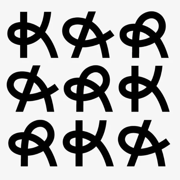
Nine variations of an abstract monoline mark where circular and linear elements interweave in continuous strokes, demonstrating a single logo system's flexibility.
Summary
Nine variations of an abstract monoline mark where circular and linear elements interweave in continuous strokes, demonstrating a single logo system's flexibility.
Visual description
A three-by-three grid of identical-height black marks on a light gray background. Each mark is drawn in a single continuous line with no fill, combining a circular form (resembling an eye or ring) with an angular linear element (a vertical stroke with offset diagonal extensions). The circular form sits at the top center, and the linear form crosses behind it, creating an interlocking effect. All nine marks are positioned consistently in their grid cells with generous whitespace. The design is pure monochrome, relying on line weight and negative space for visual interest. The strokes are crisp and evenly weighted, emphasizing precision and craft.
Key takeaway
The monoline approach is instantly recognizable and works at any scale without loss of clarity. The interlocking geometry (circle and line) creates a sophisticated abstract form that suggests both structure and flexibility. Presenting nine subtle variations demonstrates how a single conceptual mark can feel fresh and dynamic without losing brand recognition.
Reuse notes
Ideal for editorial, design-focused, or creative service brands seeking a distinctive, modern mark. The monoline technique reduces visual complexity, making it perfect for digital applications, embroidery, or carved/relief contexts. The grid-variation layout is useful for brand books or showing logo adaptations without needing multiple entirely different marks.