Preview image. Unlock full-res
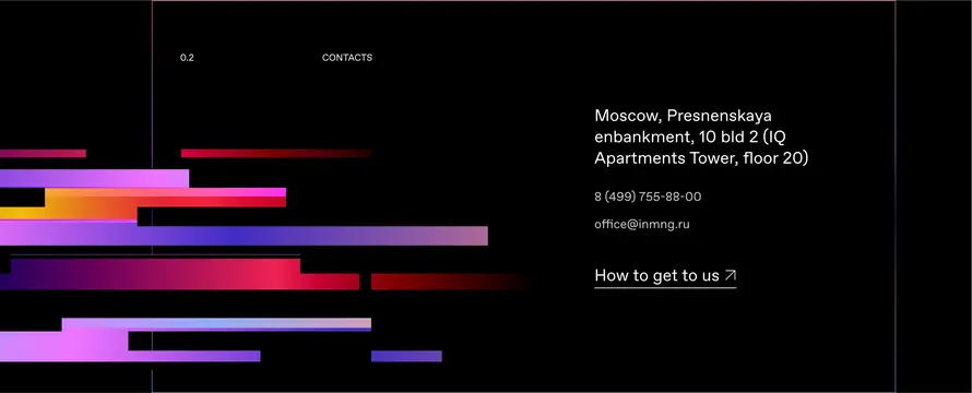
A black contact-page layout pairing a left stack of horizontal gradient bars in magenta, red and violet against a right-aligned address block and a How to get to us link.
Summary
A black contact section that turns a stack of horizontal gradient bars into its main graphic, balanced against a quiet right-hand column of address, phone, email and a directions link.
Visual description
Pure black canvas split into two zones. The lower left third is filled with a loose stack of stepped horizontal bars, each a different left-to-right gradient running through magenta, hot pink, crimson, orange and indigo, the bars varying in length and offset so they read like an equalizer or abstract cityscape. A hairline vertical rule and a small index marker (0.2) plus a CONTACTS label sit at the top. The right column holds a multi-line postal address, a phone number and email in muted violet, and a How to get to us link with a small up-right arrow. Type is a clean light-weight sans throughout.
Key takeaway
Using a stack of gradient bars as the only ornament so a plain contact block reads as designed rather than utilitarian. The deliberate length and offset variation in the bars gives rhythm without any imagery. Pairing one saturated graphic zone against a fully restrained text column keeps the contrast from feeling busy.
Reuse notes
Good for a contact or footer block on a dark agency or studio site that wants energy without a photo. The gradient palette carries the personality, so keep the type neutral. Works only on a dark background, the bars lose their glow on light.
More like this



Keep what you find
A free account saves references to boards and can send you a weekly email of picks based on what you save.
To see every result, go Pro.