Preview image. Unlock full-res
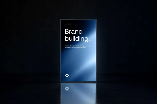
Oyre Studio brand identity displayed on a vertical mobile mockup, pairing a deep blue gradient with minimal sans-serif typography.
Summary
Oyre Studio's brand identity displayed on a vertical mobile device mockup, showcasing a premium dark aesthetic with a luminous blue gradient that creates visual depth and sophistication.
Visual description
A mobile phone mockup rendered on a dark void background. The device screen displays a dark-to-light blue radial gradient emanating from the upper right, creating a glow effect that suggests depth and luxury. The headline "Brand building." is set in large, modern sans-serif type (likely geometric/clean sans) in white, positioned in the upper-left portion of the screen. Below, a single-line tagline in smaller white text reads "We transform brands into strategy, creativity, innovation, clarity, and lasting impact." A minimalist mark composed of four small white dots arranged in a clover or floral pattern sits at the lower left of the screen. The device casts a soft reflection below it on the black background, grounding the composition.
Key takeaway
The radial gradient creating a focal point of light without relying on a background image or complex effects. The economical use of a single minimalist icon mark for memorability. The restrained color palette (white type, cool gradient, pure dark) that conveys premium positioning through subtraction rather than embellishment.
Reuse notes
Ideal for tech, design, or professional-services brands aiming for sophistication without visual noise. Works best on dark backgrounds; the gradient technique is particularly effective for digital-first presentations and app onboarding contexts where a sense of depth adds perceived value.
More like this



Keep what you find
A free account saves references to boards and can send you a weekly email of picks based on what you save.
To see every result, go Pro.