Preview image. Unlock full-res
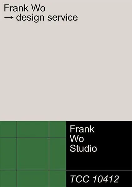
A studio identity poster styled like a Pantone chip card, pairing a green grid and black block with the name 'Frank Wo Studio' and a faux color code.
Summary
A portrait identity card for Frank Wo Studio laid out like a Pantone swatch chip: a large warm-grey field up top, a green grid and a black block side by side at the bottom, and a mock color code in the footer.
Visual description
The format is a vertical card on a warm putty-grey ground. Top-left, small black sans-serif reads "Frank Wo" with a second line "→ design service" led by an arrow glyph. The lower third splits into two equal blocks: on the left, a forest-green square ruled into a 3x3 white-line grid; on the right, a solid black rectangle carrying "Frank / Wo / Studio" in white. A thin rule runs beneath, and the footer sets "TCC 10412" in a black italic, mimicking a paint or Pantone reference number.
Key takeaway
Dressing a studio name up as a physical color swatch (named field, grid, code number) gives an otherwise plain layout a recognizable system and a wink of craft. Splitting the foot of the card into a green grid plus a black nameplate creates instant figure-ground contrast from just two blocks.
Reuse notes
Good for a designer, studio, or consultancy wanting a memorable card or social tile that signals "we think in systems." The Pantone-chip conceit reads best when the code and naming feel deliberate; pair with one saturated brand color against neutrals. Works as a profile graphic or a deck cover.