Preview image. Unlock full-res
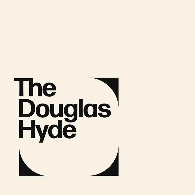
Logo locking a bold three-line grotesque wordmark inside a black square carved by two opposing circular cut-outs into a lens shape, on cream.
Summary
A logo where the name "The Douglas Hyde" is set in three tight lines of a bold grotesque, sitting inside a black square that two opposing semicircular cut-outs carve into a vertical lens or eye shape.
Visual description
A black square anchors the lower-left quadrant of a cream canvas. Into its top-right and bottom-center edges, two large white semicircles are subtracted, pinching the square into a leaf or lens silhouette with curved cusps top and bottom. The wordmark "The / Douglas / Hyde" is set in a heavy neo-grotesque sans, lowercase with capitalized initials, on three lines with very tight leading so the words stack as a solid block left-aligned over the black form. Palette is strictly two-tone: near-black (#111111) on warm off-white (#F9F1E4). No other graphic element competes.
Key takeaway
The container is the idea: a plain square minus two circles becomes a distinctive lens mark that can hold type or stand alone. The tight-leading three-line lockup turns a long institutional name into a compact, confident block instead of a thin horizontal strip.
Reuse notes
Built for an arts venue, gallery, or cultural institution, the geometry reads sharp at signage scale and small in a favicon. Works only as a high-contrast duotone; the carved silhouette loses legibility if reversed onto a busy background. Keep the cream rather than pure white to soften the severity.
More like this


Keep what you find
A free account saves references to boards and can send you a weekly email of picks based on what you save.
To see every result, go Pro.