Preview image. Unlock full-res
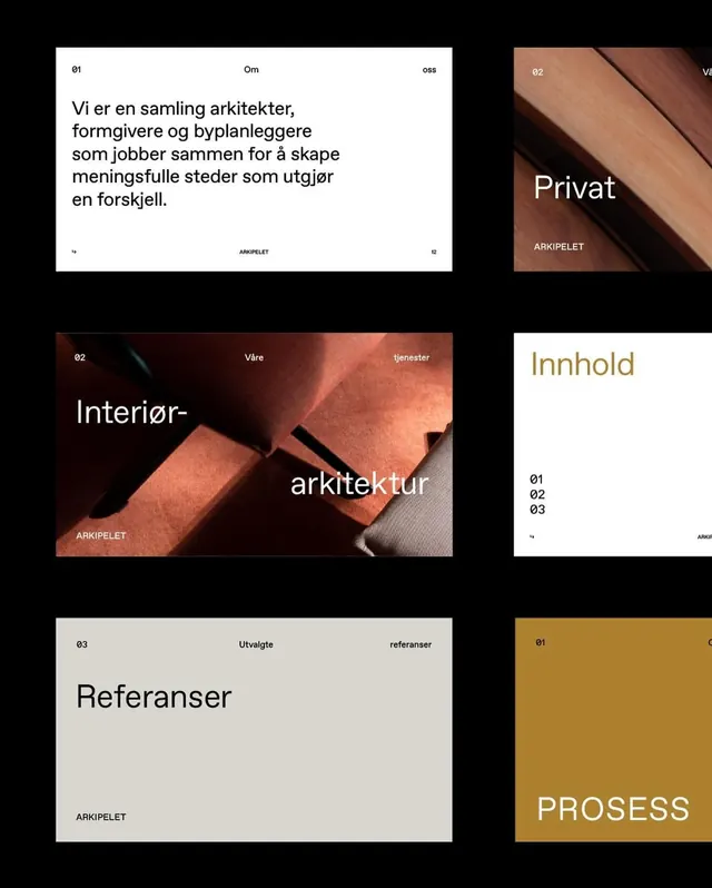
A six-up grid of brand layouts for the architecture studio Arkipelet, pairing numbered grotesque headers with warm interior photography across white, terracotta, and mustard panels.
Summary
A two-by-three grid of brand-page layouts for the Norwegian architecture studio Arkipelet, separated by thick black gutters. The system is held together by a consistent running header (section number, title, sub-label) and an "ARKIPELET" footer on every layout.
Visual description
Six layouts float on a black field. Each carries a numbered grotesque header spread edge to edge: "01 Om oss", "02 Vare tjenester", "03 Utvalgte referanser", plus a small page number bottom-right. The top-left panel is a white intro page with a left-aligned paragraph in Norwegian. Adjacent panels alternate between full-bleed warm photography (close crops of timber and a terracotta upholstered chair) with white overset titles, and flat color blocks: a white contents page with a mustard "Innhold" heading over a numbered 01/02/03 list, a grey "Referanser" page, and a saturated mustard panel with "PROSESS" set in a high-waisted serif. Type mixes a neutral grotesque for headers and body with an occasional contrast serif for the large section words.
Key takeaway
Lock a single header-and-footer grammar (number, running title, sub-label, plus a corner page number and a fixed wordmark) and let the body of each page swing freely between text, photo, and solid color. The earthy terracotta-and-mustard accents tie photographic and flat pages into one family.
Reuse notes
A strong template for architecture, interiors, and studio portfolios that need a long document or deck to feel systematic without being rigid. The warm palette reads premium but is culture-specific, swap accents to retarget. Needs genuinely good interior photography to carry the photo pages.
More like this



Keep what you find
A free account saves references to boards and can send you a weekly email of picks based on what you save.
To see every result, go Pro.