Preview image. Unlock full-res
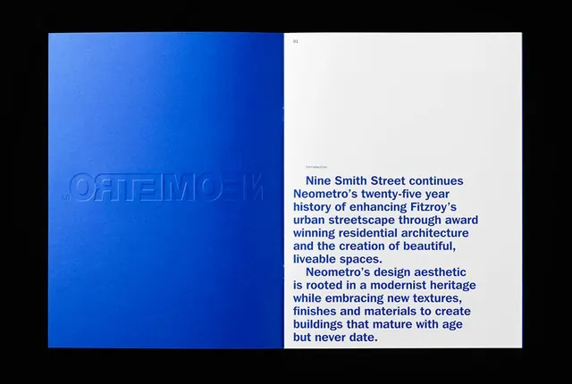
A printed brand booklet for residential architecture studio Neometro, open to an interior spread: left page is a solid electric-blue cover with a debossed reversed wordmark, right page is an off-white introduction page set in large bold blue sans-serif.
Summary
A Neometro brand booklet lies open: the left page is a saturated royal-blue cover with "NEOMETRO" debossed in reversed mirror orientation, while the right page opens to an introduction in large bold blue sans-serif on off-white, photographed on a black surface.
Visual description
Landscape photograph of a printed booklet lying on a near-black surface, shot from directly above. Left page: a flat-saturated royal blue (#0133AD range) with the wordmark "NEOMETRO" pressed in as a deboss, appearing as a reversed mirror-text relief in the same blue, no ink contrast, only shadow depth. A small "MT" registration mark is visible at bottom-left. Right page: off-white uncoated stock, page number "01" and a label "Introduction" in small grey sans-serif at the top. The body text is set in a bold geometric sans-serif at approximately 18-20pt, all in the same royal blue as the cover, reading in long bold sentences about Nine Smith Street and the studio's design philosophy. The text is left-aligned with an indent on the first line of each paragraph, no other graphic elements on the right page.
Key takeaway
The debossed same-color relief on a solid cover: no second ink, no contrast, only texture and shadow to carry the wordmark. This works because the cover color is loud enough on its own and the deboss adds a premium print-finish signal. Setting the interior body copy bold at display scale in the exact brand color, rather than in a text weight or neutral, creates unusual typographic boldness for a booklet intro and makes the right-hand page an extension of the cover's energy rather than a retreat to neutral.
Reuse notes
Strong reference for property development, architecture, or high-end agency brand materials where a single accent color needs to carry the whole system. The deboss technique requires print production with the right paper weight. The bold body-copy style works in digital contexts too (brand PDF, investor deck intro) but should be reserved for short, declarative statements, not long-form content.
More like this






Keep what you find
A free account saves references to boards and can send you a weekly email of picks based on what you save.
To see every result, go Pro.