Preview image. Unlock full-res
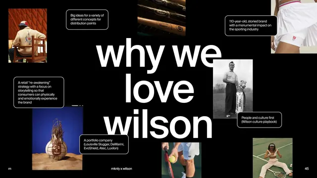
High-contrast black editorial spread centered on large white headline text, with surrounding photographs, callout boxes, and strategic copy presenting a sporting brand's heritage and culture.
Summary
A high-contrast editorial spread with large centered white headline (why we love wilson) on pure black, surrounded by black-and-white archival and product photographs, flanked by bordered callout boxes articulating the brand's strategic positioning and heritage.
Visual description
Solid black background dominates the composition. Center: massive white sans-serif headline "why we love wilson" set in bold display type, roughly two lines, occupying the visual center. Surrounding the text: six photographs (archival portraits, product detail of vintage equipment, manufacturing imagery, athlete in action, contemporary product shot) arranged asymmetrically around the margins, each about one-third to one-quarter the spread width. White border boxes with black type sit adjacent to or overlaying the photos, containing short strategic statements ("Big ideas for a variety of different concepts for distribution points", "A retail 're-engineering' strategy with a focus on storytelling", "110-year-old storied brand with a monumental impact on the sporting industry", "Wilson culture playbook"). Small page number (45) in bottom corner; credit line ("mknly x wilson") in soft gray below the main image block.
Key takeaway
The confident scale of the headline commands attention without decoration; the surrounding images and boxed text create a documentary feel that grounds the brand narrative in authenticity. High contrast and monochromatic treatment strips away distraction and lends gravitas. The asymmetric, editorial grid (tight margins around text, looser around image clusters) makes the spread feel curated, not templated.
Reuse notes
Strong for brand positioning or heritage storytelling, especially in premium, professional, or corporate contexts. Needs strong archival or product photography to justify the image weight. Works best as a centerpiece in a longer editorial story rather than a standalone page. The black background demands careful typography scaling for print or screen.
More like this




Keep what you find
A free account saves references to boards and can send you a weekly email of picks based on what you save.
To see every result, go Pro.