
Preview image. Unlock full-res
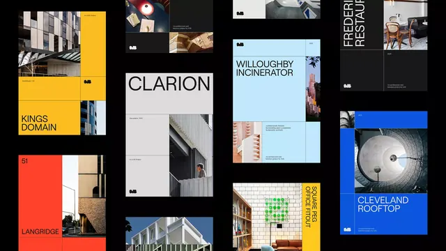
A multi-page editorial system for a design studio with a dark-blue header, colorful imagery grid, and structured portfolio layouts anchored by sans-serif typography and generous white space.
Summary
A multi-page editorial system for a design studio with a dark-blue header, colorful imagery grid, and structured portfolio layouts anchored by sans-serif typography and generous white space.
Visual description
The spread opens with a letter-spaced pill or badge treatment above a sans-serif heading, establishing a calm introduction. Below sits a square card (device mockup or specimen) showing muted tones and a clean layout. The second section pairs a large farm landscape and lifestyle photography on the left against a right-side grid of four smaller images (tech, natural, product, abstract) in vibrant but controlled colors. A dark section follows with white type and metadata, then transitions to a vivid blue-background portrait hero, anchored by bold sans-serif heading and lighter subtext. Throughout, the layout breathes with white space, the color palette shifts from muted to vibrant to dark, and typography remains consistent and oversized where it leads.
Key takeaway
The three-part visual rhythm (pale intro, colorful imagery, dark-blue hero) creates strong modular sections. The mix of large-format photography with tightly-gridded smaller images gives visual variety. The pill-shaped badge or label accent (yellow, light blue) works as a consistent navigation/category marker.
Reuse notes
Strong reference for design studio or creative agency branding. The structured grid plus free breathing room works well for portfolio case studies. The dark-blue accent is versatile enough to pair with many color stories; rotate the photography style to adapt to different industries (tech, food, retail).
More like this





Keep what you find
A free account saves references to boards and can send you a weekly email of picks based on what you save.
To see every result, go Pro.