Preview image. Unlock full-res
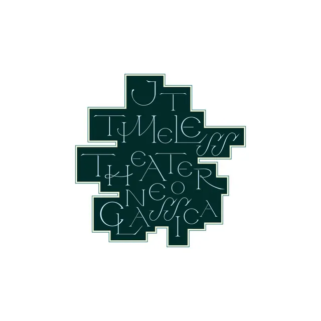
Ornate swash-serif lettering reading TIMELESS THEATER NEOCLASSICA packed into a cream-outlined stepped teal silhouette, a typographic logo built like an interlocking tile.
Summary
A theater wordmark whose ornate swash-serif lines, JT TIMELESS THEATER NEOCLASSICA, are nested into a single cream-outlined stepped block of deep teal, so the lettering and the container read as one tessellated tile.
Visual description
The mark sits centered on white. The dark teal body has a pixel-stepped, jigsaw-like outer edge picked out in a thin cream keyline, and the letters are pale blue, rendered in a high-contrast display serif loaded with calligraphic swashes, long descenders, and looping ligatures (the double-s of TIMELESS and CLASSICA spiral into the negative space). Lines are set at different scales and woven together so ascenders and tails fill the stepped notches of the silhouette, leaving almost no empty interior. The result is dense and decorative but still legible line by line.
Key takeaway
Fitting type to a non-rectangular container: shaping the background block in stepped jigsaw notches and then growing the letterforms' swashes and tails to occupy exactly those notches, so word and frame interlock. The thin cream keyline around a dark fill, a cheap, classic way to make a solid shape feel crafted.
Reuse notes
Reach for this on a theater, opera, festival, or heritage-luxury identity where a stamp or badge logo needs personality. The interlocking shape works as a sticker, foil emboss, or app icon. Caveat: the swash density limits how small it can scale before the ligatures muddy, so keep a simplified secondary lockup.
More like this



Keep what you find
A free account saves references to boards and can send you a weekly email of picks based on what you save.
To see every result, go Pro.