Preview image. Unlock full-res
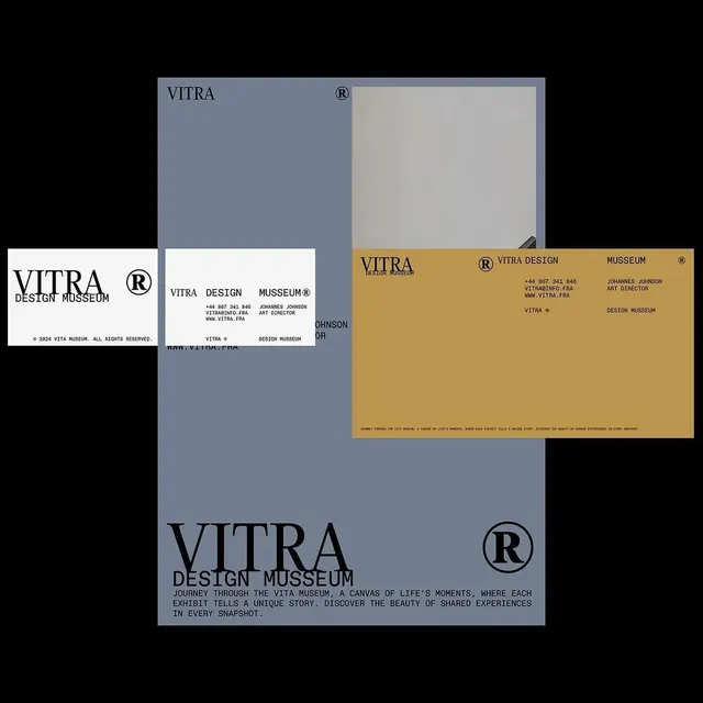
Identity system featuring a split-color layout with slate blue, cream, and gold panels, showcasing wordmark, monospace contact details, and registered trademark.
Summary
Identity system featuring a split-color layout with slate blue, cream, and gold panels, showcasing wordmark, monospace contact details, and registered trademark.
Visual description
Multiple compositions of Vitra Design Museum branding arranged as a collage. The wordmark "VITRA DESIGN MUSEUM" uses a clean serif paired with a circled R registered-mark. Three dominant color fields structure the layouts: a muted slate blue, off-white cream, and warm mustard gold. Contact information and credits appear in a tight monospace typeface. Text alignment is left-flush and ranged flush; the compositions show business cards, guideline pages, and system applications with consistent margins and hierarchical spacing.
Key takeaway
The three-color palette (cool blue, neutral cream, warm gold) creates institutional authority without heaviness. The contrast between serif and monospace typefaces signals both formality and technical precision. The modular color blocking allows flexibility; panels can be rearranged while retaining visual coherence.
Reuse notes
Ideal for cultural, academic, or design institutions. The warmth of the gold offsets the coolness of the blue, preventing a sterile feel. Works best when the color panels remain uncluttered; treat them as zones with breathing room.
More like this







Keep what you find
A free account saves references to boards and can send you a weekly email of picks based on what you save.
To see every result, go Pro.