Preview image. Unlock full-res
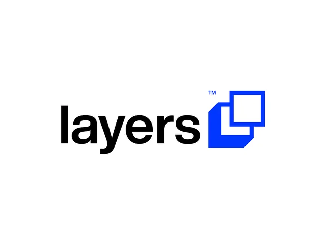
A lowercase black 'layers' wordmark paired with a blue mark of two overlapping squares, one solid and one outlined, that literally diagrams the idea of layering.
Summary
A horizontal lockup pairing a heavy lowercase black "layers" wordmark with an electric-blue mark of two overlapping squares, where the mark visually spells out the brand name through stacked geometry.
Visual description
Set on a flat white field. The wordmark "layers" sits left in a bold lowercase grotesque sans, tight spacing, ink-black. To its right is the mark: a solid blue square with a clipped lower-left corner sits behind an outlined blue square that overlaps its top-right, so the two read as stacked sheets. A small superscript blue "TM" tucks above the mark. The two squares share the same blue, separated only by fill versus outline, which keeps the overlap legible without a third color.
Key takeaway
The mark is a one-to-one diagram of the brand noun: two literal layers built from a filled square plus an outlined square. The clipped corner on the solid square adds just enough character to avoid a plain checkbox while staying inside a strict geometric system.
Reuse notes
A clean template for any product whose name is a concrete noun you can draw, software, infrastructure, design tools. The single accent blue plus black keeps it cheap to print and easy to reverse on dark. Pair with the loud accent color on one CTA only.
More like this




Keep what you find
A free account saves references to boards and can send you a weekly email of picks based on what you save.
To see every result, go Pro.