Preview image. Unlock full-res
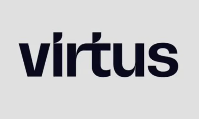
The word 'virtus' in heavy lowercase navy sans-serif where the dotless i merges into the t's crossbar as one continuous horizontal stroke, creating a distinctive ligature-based logotype.
Summary
A single-color lowercase wordmark spelling "virtus" in a heavy navy sans-serif where the dotless i and t share one continuous horizontal crossbar, merging two letters into a unified mark with a single custom detail.
Visual description
The word "virtus" is set large and centered on a flat light-grey background with generous margins. All letterforms are rendered in a heavy-weight, near-black navy geometric sans-serif with consistent stroke weight and slightly squared terminals. The spacing between letters is tight and even. The defining custom element is the shared crossbar: the i has no dot and its vertical stem feeds directly into the t's horizontal stroke, creating a single uninterrupted line that spans both letters at the mid-height of the word. The u and s are fully rounded curves with generous bowls, softening the otherwise rigid vertical architecture of the v and t. The entire wordmark is monochromatic, with no secondary marks, icons, or accompanying text.
Key takeaway
The i-t ligature technique: removing the traditional dot from the i and merging its stem into the t's crossbar creates a recognizable brand mark with zero additional elements or decorative flourishes. A monochromatic wordmark in a single weight maintains versatility across applications while the ligature adds memorable custom character.
Reuse notes
A strong starting point for tech, consulting, or professional-services wordmarks that need to convey solidity and modernity without a symbol component. The approach works best when the i and t are adjacent in the brand name, since the ligature principle depends on that proximity. The heavy weight reads best at large display sizes; at small scale the stroke weight may collapse or fill in. Single-color execution ensures durability across digital and print contexts.
More like this



Keep what you find
A free account saves references to boards and can send you a weekly email of picks based on what you save.
To see every result, go Pro.