Preview image. Unlock full-res
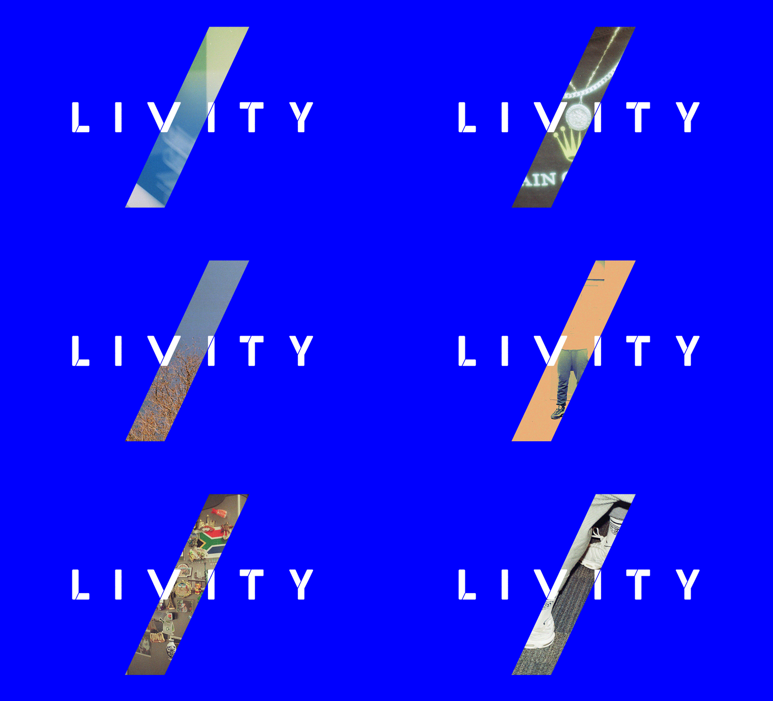
A wordmark with white sans-serif caps split by a diagonal gradient bar flowing from cream to teal, anchoring a tech brand identity.
Summary
A wordmark with white sans-serif caps split by a diagonal gradient bar flowing from cream to teal, anchoring a tech brand identity.
Visual description
White all-caps sans-serif spaced letterforms spell "LIVITY" against a solid royal-blue background. A diagonal slash cuts through the middle letters at a steep angle, filled with a gradient flowing from pale yellow-green at the top through teal-gray to pale blue at the bottom. The slash has soft edges and sits behind the type, creating visual separation while maintaining cohesion. The geometry is sharp and intentional, with the diagonal bar suggesting forward motion and disruption.
Key takeaway
The diagonal as a unifying structural element rather than ornament. The gradient bar passing behind the type layers depth without complicating the letterforms. The high saturation blue ground keeps the mark scannable and distinctive at small sizes.
Reuse notes
Works well for tech, fintech, or productivity brands seeking a bold, forward-looking identity. The simplicity scales well across applications. Less suited for luxury or organic sectors. The high contrast blue-on-white limits versatility on colored backgrounds.
More like this



Keep what you find
A free account saves references to boards and can send you a weekly email of picks based on what you save.
To see every result, go Pro.