Preview image. Unlock full-res
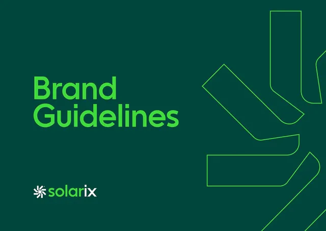
A brand guidelines cover for \"Solarix,\" pairing lime \"Brand Guidelines\" type on deep forest green with an oversized outlined arrow mark bleeding off the right edge.
Summary
A landscape brand-guidelines cover for "Solarix" that sets lime "Brand Guidelines" on a deep forest-green field and balances it with a large outlined arrow or chevron graphic bleeding off the right edge.
Visual description
The background is a saturated dark green. Top-left, "Brand Guidelines" stacks across two lines in a bright lime bold geometric sans. Bottom-left sits the logo lockup: a small white burst or spark glyph next to the lowercase wordmark "solarix," where "solar" is white and "ix" flips to lime. The right half is filled by an oversized arrow-like form drawn only as a thin lime outline with rounded corners, cropped so it runs off the canvas. The whole cover lives in two greens plus white, a tonal rather than high-contrast palette.
Key takeaway
Drawing the hero graphic as a single thin outline at huge scale and letting it bleed off-frame, so it reads as texture rather than a centered logo. The two-tone wordmark (white root, lime suffix) is a cheap way to spotlight the brand's accent without a separate mark.
Reuse notes
A strong template for a tech or sustainability brand's cover slide or guidelines PDF. The tonal green-on-green keeps it calm; push the accent lime brighter for CTAs elsewhere in the system. Needs the outlined graphic to be genuinely large to avoid looking like clip art.
More like this


Keep what you find
A free account saves references to boards and can send you a weekly email of picks based on what you save.
To see every result, go Pro.