Preview image. Unlock full-res
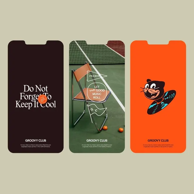
Three phone screens for Groovy Club, a French music association, pairing a serif slogan, a tennis-court photo with badge stamps, and an orange panther mascot riding a vinyl record.
Summary
A three-up brand identity board for Groovy Club showing how one music-association system flexes across a serif slogan screen, a photographic badge layout, and a playful mascot illustration.
Visual description
Three vertical phone frames lie flat on a sage-olive background. The left screen is dark maroon-brown with the slogan Do Not Forget To Keep It Cool set in a contrasty editorial serif, a small orange LET THE GOOD MUSIC ROLL stamp tucked into the type. The center screen is a photograph of a tan leather folding chair on a green tennis court by the net, overlaid with thin-line white badge graphics: a FRANCE pennant, a circular LET THE GOOD MUSIC ROLL stamp, and a G.C pennant, with two stray tennis balls below. The right screen is bright orange with a cartoon black panther mascot, blue highlights and an orange snout, riding or balancing on a spinning vinyl record. All three share a bottom lockup: GROOVY CLUB in a bold sans cap, with a two-line description noting it is a French association that DJs and organizes music parties in the north of France.
Key takeaway
Show a brand as a three-panel system so the viewer reads the range in one glance: a type-only voice screen, a photographic application with line-badge overlays, and an illustrated mascot expression. Reusing one fixed bottom lockup across all three ties wildly different visuals into a single identity.
Reuse notes
A strong template for presenting any small music, club, or events brand on a moodboard or case-study slide. The thin-line badges floating over real photography is an easy, repeatable application style. Pairs well with a flexible serif plus bold sans pairing; the mascot keeps it from feeling too austere.
More like this






Keep what you find
A free account saves references to boards and can send you a weekly email of picks based on what you save.
To see every result, go Pro.