Preview image. Unlock full-res
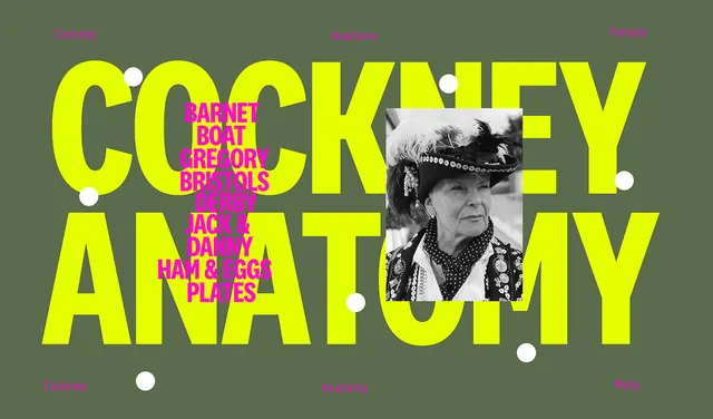
Bold yellow sans-serif 'COCKNEY ANATOMY' layered over sage-green background with a cropped B&W photograph and magenta graphic accents.
Summary
A graphic composition layering oversized yellow sans-serif headline over a muted sage-green field, with a cropped black-and-white photograph and hot-magenta graphic marks as supporting elements.
Visual description
The poster stacks "COCKNEY ANATOMY" in bold, expanded sans-serif in bright yellow (#E4FF00), positioned to break across the canvas. Behind the type sits a muted olive-green background (#5B6C4C). A B&W photograph of a figure wearing a cowboy hat is cropped and positioned to the right side, partially obscured by the overlaying typography. Hot magenta/pink graphic shapes and a white dot accent the composition, creating visual rhythm. The overall effect is a confident, graphic-design approach combining bold type, high chroma, and cool-warm contrast.
Key takeaway
The layering strategy: overlaid oversized type over a complementary photograph without fully hiding either; the limited, high-chroma palette (yellow, magenta, muted green) creating maximum impact; cropping and positioning photography as a graphic element rather than a window.
Reuse notes
Strong for editorial, event, or music branding where impact matters over legibility. The high-contrast palette and layering strategy work well on smaller formats (posters, covers) and read from a distance. Avoid on backgrounds that are already busy.