Preview image. Unlock full-res
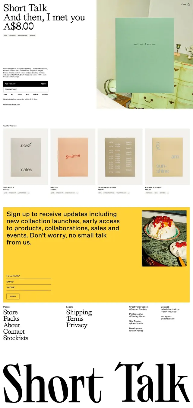
Full product page for a stationery brand, pairing an editorial serif headline with softly styled product photography, a curated four-card grid, and a saturated-yellow newsletter block.
Summary
A greeting-card product page anchored by an oversized serif headline and price, flanked by a styled product shot; a grid of four related-product cards sits below, with a bold mustard-yellow newsletter block and a large serif wordmark closing the page.
Visual description
Cream-white background throughout. Top section: large serif headline and price anchor left, tiny sans-serif tag pills and body copy below, plus a minimal add-to-cart form and store-finder link. Right side shows a single mint-green greeting card propped on a pale-green dresser, softly lit, creating a lifestyle context. Thin rule divides sections. "You May Also Like" four-card grid displays in one row: grey, coral, sage, and warm-beige card images each with title, price, and small-caps sans tags below. Below the grid, a full-width mustard-yellow band carries multi-line sign-up message in serif, with full-name, email, and phone input fields, plus a small inset photo of plated food on the right side. Footer lists page links and site credits in two weight/style combinations. Page closes with an enormous black serif wordmark bleeding off both left and right edges.
Key takeaway
Pairing one editorial serif for headlines and wordmark identity with a compact all-caps sans for labels and functional text creates a refined-but-accessible shopping experience. Isolating a single high-saturation yellow block as the newsletter call-to-action makes it pop without feeling pushy; it serves as a visual "interrupt" separating calm sections. Oversizing the footer wordmark transforms a routine branding moment into a design statement that anchors the entire page.
Reuse notes
Strong template for lifestyle, stationery, or artisanal e-commerce where product photography is soft and carefully styled. The yellow newsletter band is repeatable as a divider between lower-stakes content sections. Works best with a strong serif typeface and genuinely good pastel product photography; weak imagery will expose the restraint as empty space rather than intentional calm.
More like this


Keep what you find
A free account saves references to boards and can send you a weekly email of picks based on what you save.
To see every result, go Pro.