Preview image. Unlock full-res
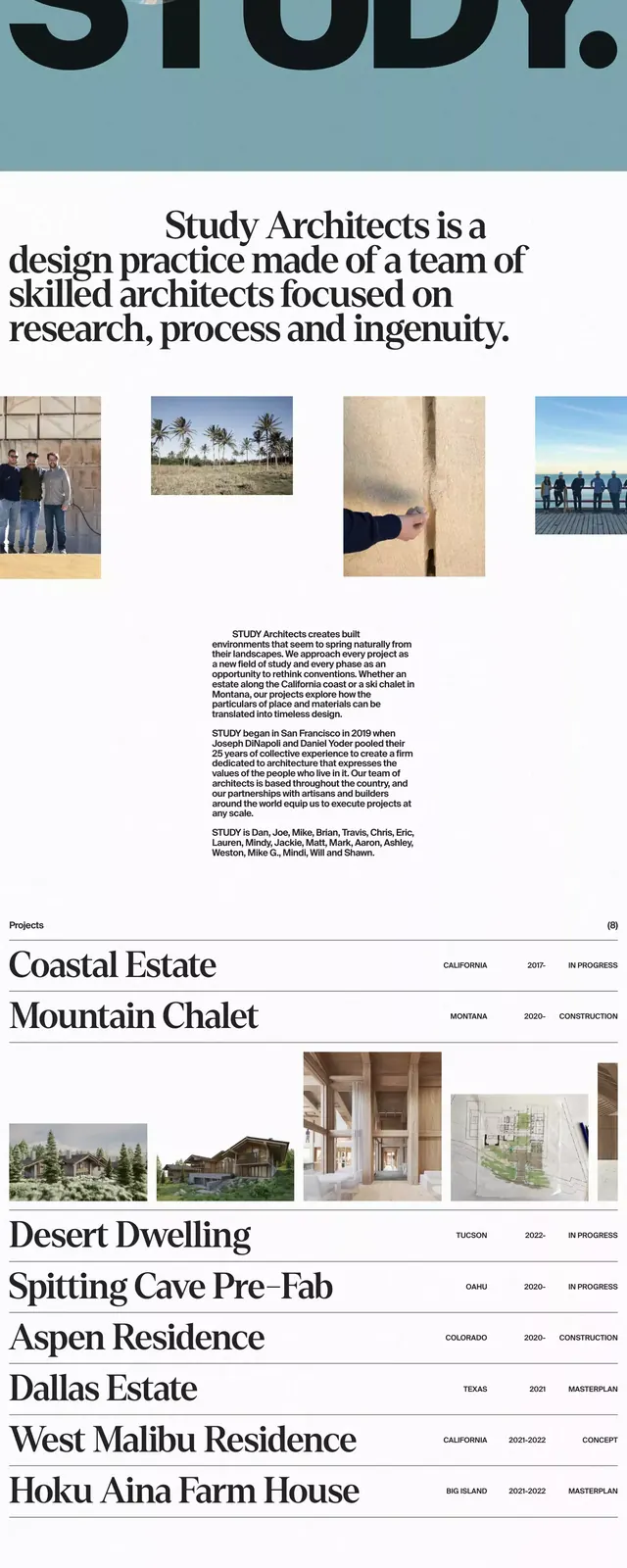
Architecture studio homepage led by oversized sans wordmark on a pale-blue band, resolving into an editorial index of projects with serif headings and stacked photography.
Summary
Architecture studio homepage led by a massive sans wordmark "STUDY." on a powder-blue band, transitioning into a ruled editorial index of project names paired with archival-style metadata and stacked architectural photography.
Visual description
The header positions an oversized bold grotesque "STUDY." across a soft powder-blue horizontal band, anchored by a small grey wordmark in the top-left corner. Below this, a serif statement is centered in generous leading, introducing the studio's practice. The main body shifts to a clean light layout: a thin-ruled editorial list of project titles ("Coastal Estate", "Mountain Chalet", "Desert Dwelling", and others) set as large serif headings flush left, each paired with tiny sans-serif metadata (dates, collaborators) at the margins. Full-width and two-column landscape photographs of architectural interiors and group portraits in muted naturals are interleaved between list entries. The footer displays the studio's email and contact line in the same restrained typeface. The page balances one commanding display moment against an austere ruled-list editorial grid.
Key takeaway
The contrast between a single oversized sans display wordmark and a delicate centered serif paragraph establishes a confident, gallery-like tone. Treating a project portfolio as a thin-ruled editorial index with serif project names plus margin metadata gives the site the authority of a printed catalogue rather than a card layout. The pale-blue header band is the page's only color anchor, keeping the focus on photography.
Reuse notes
A strong model for architecture, interiors, or design-studio portfolios, or any practice wanting its work to read as an editorial sequence rather than a browsable card grid. Pairs a geometric sans display type with a refined serif body type. The ruled-list pattern requires evocative project names and strong architectural photography; it falls flat with placeholder images or generic naming.
More like this


Keep what you find
A free account saves references to boards and can send you a weekly email of picks based on what you save.
To see every result, go Pro.