Preview image. Unlock full-res
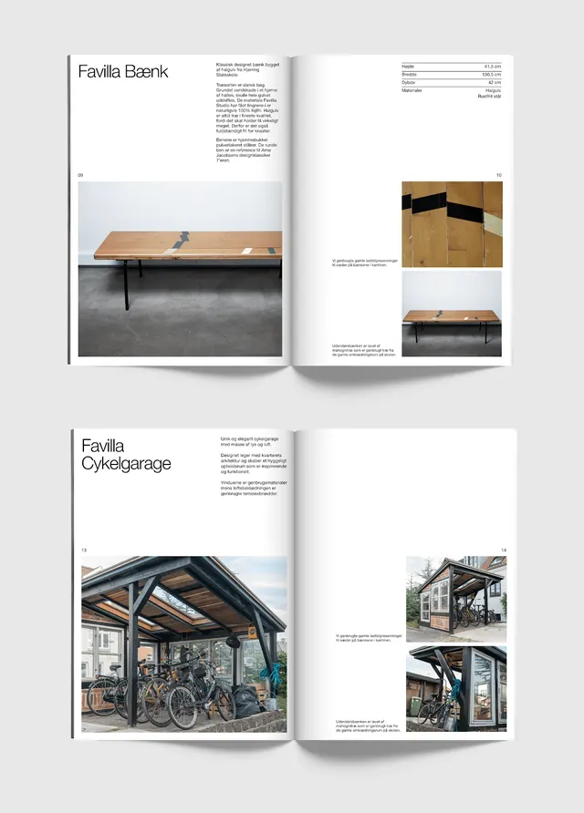
Two stacked print spreads from a Favilla furniture catalog, pairing left-aligned product names with photography and tiny spec captions on bright white pages.
Summary
A mockup of two open catalog spreads for the furniture brand Favilla, each leading with a product name ("Favilla Bænk", "Favilla Cykelgarage") in a serif headline set against acres of white space.
Visual description
Two flat-lay magazine spreads sit angled on a pale gray surface. Each left page opens with a product title top-left in a fine serif, followed by a short justified paragraph of body copy and a small spec table (rows of values, dimensions). Large photographs anchor the lower portion: a slim wooden bench on a concrete floor, then an outdoor timber bike shelter with a curved roof. Right pages stay mostly empty, carrying one or two cropped detail photos low on the page and small folio numbers in the corners. The palette is restrained, off-white paper, charcoal text, warm wood and muted concrete tones from the imagery. Generous margins and a strict baseline give the whole thing a quiet, Scandinavian product-catalog calm.
Key takeaway
Letting the product photo and a single serif title do all the work while 60 to 70 percent of each page stays empty signals confidence and premium positioning. The tiny tabular spec block paired with that luxury of white space is a clean way to be informative without crowding.
Reuse notes
Reach for this when a furniture, lighting, architecture, or homeware brand needs a catalog or lookbook that feels considered rather than salesy. Demands strong, evenly lit product photography; the empty pages will read as cheap, not luxe, if the images are weak.
More like this





Keep what you find
A free account saves references to boards and can send you a weekly email of picks based on what you save.
To see every result, go Pro.