Preview image. Unlock full-res
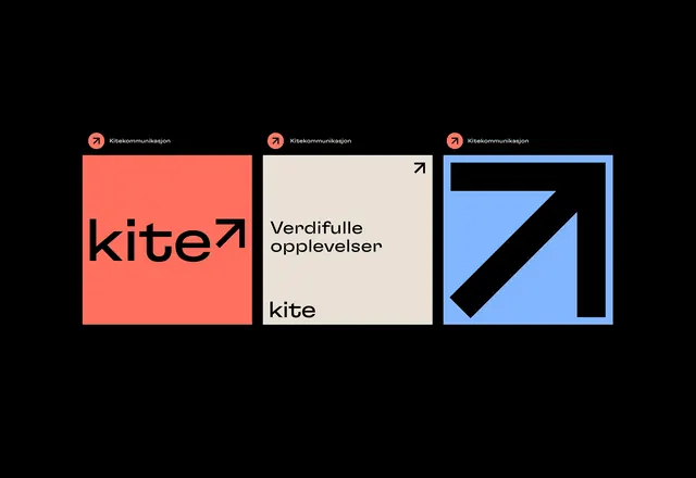
Three square brand tiles for agency Kite, pairing a lowercase wordmark and rising-arrow mark across coral, beige, and blue panels on black.
Summary
A three-tile brand identity for "Kite" (Kitekommunikasjon) that flexes one geometric system across solid coral, beige, and blue squares, unified by a circular arrow badge and a lowercase wordmark.
Visual description
Three equal squares sit side by side on a pure black field. Each carries the same header lockup: a coral circle holding a black upward-right arrow, followed by the name "Kitekommunikasjon" in small white sans-serif caps. The coral tile shows the lowercase wordmark "kite" with the arrow glyph replacing nothing but trailing the word. The center beige tile is a tagline panel, "Verdifulle opplevelser" in two lines, a small arrow in the top-right corner, and the "kite" wordmark anchored at the bottom-left. The blue tile is pure mark: an oversized black arrow drawn as a thick stroke inside a square outline, filling the panel edge to edge. The typeface is a geometric sans with a circular lowercase "e" and rounded terminals.
Key takeaway
The arrow doubles as both a logo glyph and a scalable graphic device: tiny in the badge, inline as a wordmark suffix, then blown up to fill an entire tile. One shape covers logo, accent, and hero art. The fixed header lockup plus swappable background color keeps a social or print series instantly recognizable while staying varied.
Reuse notes
A clean template for an agency or service brand that needs a flexible social-tile or business-card set. The single repeated mark scaled across sizes is the load-bearing idea; supply a strong directional glyph or it falls flat. Works best with bold solid color fields and generous margins.
More like this






Keep what you find
A free account saves references to boards and can send you a weekly email of picks based on what you save.
To see every result, go Pro.