Preview image. Unlock full-res
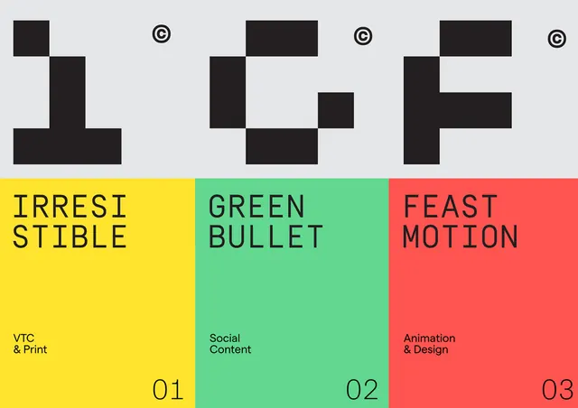
Bold geometric letter marks (I, F, P) above three color-blocked brand divisions (Yellow: VTC & Print, Mint: Social Content, Coral: Animation & Design).
Summary
A corporate branding system dividing three service lines using abstract black letter-form marks above three equal color-blocked panels (yellow, mint-green, coral) with department names and capabilities.
Visual description
Top half: three abstract geometric lettermarks (I, F, P) rendered in solid black, each with a copyright symbol (®) placed cleanly within the composition. Bottom half: three equal vertical color blocks (left: bright yellow, center: bright mint green, right: vibrant coral) with layered typography. Each block shows a large all-caps bold department name (IRRESI STIBLE, GREEN BULLET, FEAST MOTION) in black type, with smaller supporting text below (VTC & Print, Social Content, Animation & Design) and numbered labels (01, 02, 03) in the bottom corner. The overall grid is perfectly divided with sharp color transitions creating high contrast and visual separation.
Key takeaway
The geometric lettermarks as department identifiers are memorable and modular: each could work standalone or as a system. The three-color distribution (yellow + mint + coral) is energetic but balanced across hue, creating variety without chaos. All-caps sans-serif type on color blocks provides maximum legibility and reinforces the bold, modern identity.
Reuse notes
Ideal for agencies or studios with distinct service lines needing rapid brand recognition. The color scheme is vibrant and works well in digital and print contexts. Scale the marks and type together to maintain the proportion; the geometric abstraction loses impact if letterforms become too small. Works best in full-color contexts; this palette is difficult to reduce to single-color.
More like this




Keep what you find
A free account saves references to boards and can send you a weekly email of picks based on what you save.
To see every result, go Pro.