Preview image. Unlock full-res
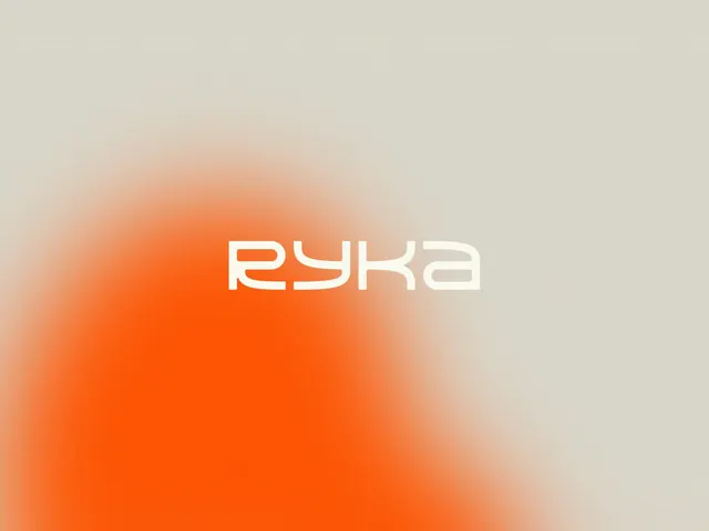
A lowercase futuristic 'ryka' wordmark in cream, set centered over a grainy off-white field bleeding into a soft orange gradient glow from the lower left.
Summary
A single cream-colored "ryka" wordmark centered on a grainy beige background that fades into a saturated orange gradient cloud rising from the lower-left corner. The defining move is the soft, blurred orange haze framing an otherwise empty canvas around one clean logotype.
Visual description
The logotype is set in lowercase using a rounded, slightly futuristic geometric sans with open counters and a distinctive curved "y" and "k", rendered in a warm cream that sits a shade lighter than the background. It is placed at the optical center, fairly small relative to the frame. The background is a flat warm gray-beige carrying a visible film-grain texture; from the bottom-left a vivid orange gradient blooms upward and inward, densest at the corner and dissolving softly toward the middle so it never reaches the type. The grain unifies the soft gradient and the flat field into one surface.
Key takeaway
A single off-corner gradient bloom turns an empty background into directional energy while keeping the logo on a calm neutral. Matching the wordmark color to a lighter tint of the background (cream on beige) gives a quiet, premium tone-on-tone read instead of hard contrast. The overlaid film grain ties the blurred gradient to the flat field so the composite reads as one texture, not a pasted glow.
Reuse notes
Strong for logo-reveal frames, brand-board hero tiles, or a tech or lifestyle company's loading and title screens. Swap the gradient hue to re-theme per sub-brand while keeping the neutral base. The tone-on-tone wordmark only works when the gradient stays clear of the type; push the bloom too central and the logo disappears.
More like this

Keep what you find
A free account saves references to boards and can send you a weekly email of picks based on what you save.
To see every result, go Pro.