Preview image. Unlock full-res
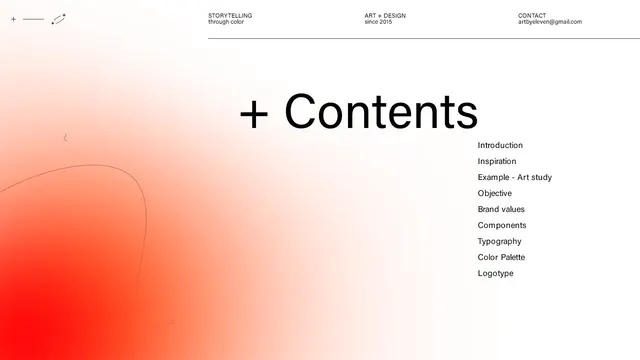
A typographic specimen layout with a plus-sign icon and 'Contents' heading set against a warm diagonal gradient from pale salmon to deep orange-red.
Summary
A type specimen showing a "Contents" headline with plus-icon and a sidebar menu list, anchored by a warm salmon-to-red diagonal gradient that establishes a creative, approachable voice.
Visual description
Pale background with a dynamic warm gradient flowing diagonally from pale salmon in the top-right to deep orange-red in the bottom-left. A bold plus sign (+) sits left of a sans-serif "Contents" heading in dark gray. Below, a right-aligned vertical list of menu items (Introduction, Founder, Brand Values, Typography, Color Palette, Use Cases) in small sans-serif type. The gradient is soft and organic, without hard edges, creating visual depth and emotional warmth.
Key takeaway
The diagonal gradient gradient technique draws the eye and establishes mood without overwhelming the typography. Pairing a directional gradient with centered, right-aligned, or asymmetric type creates visual tension and sophistication. The plus-icon as a framing device adds personality and signals navigation or expansion.
Reuse notes
Effective for design studios, creative agencies, and portfolios where brand personality matters more than corporate neutrality. The warm gradient works well in digital presentations, landing pages, and printed materials. Test on dark backgrounds; the pale type may need adjustment.
More like this



Keep what you find
A free account saves references to boards and can send you a weekly email of picks based on what you save.
To see every result, go Pro.