Preview image. Unlock full-res
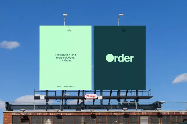
A diptych rooftop-billboard mockup for Order, pairing a mint copy panel with a dark-teal logo panel whose circular dot-O wordmark anchors the brand against a blue sky.
Summary
A two-panel rooftop billboard for "Order" shown against a clear blue sky: a mint-green panel holds a short tagline, a dark-teal panel holds the wordmark whose capital O is rendered as a solid filled circle. The mint-and-teal pairing plus the dot-O mark is the identity in a nutshell.
Visual description
A bright daytime photo: deep blue sky with a few clouds above a weathered brick industrial building. Two large portrait-format billboard posters sit side by side on the rooftop frame, each lit by a small gooseneck lamp. The left poster is pale mint green carrying a three-line tagline in dark teal sans-serif ("The solution isn't more solutions. It's Order.") with a small all-caps line below ("Schedule a demo at order.co"). The right poster is dark teal with the "Order" wordmark centered in mint, its leading O a filled circle that doubles as a logo dot. A small red "Heritage" oval sign sits on the catwalk between the building and the billboards. The brand's two colors invert across the two panels.
Key takeaway
Inverting the same two-color pair across a diptych, message panel in light, logo panel in dark, so one identity reads as two coordinated units. Building the wordmark's capital O as a solid disc that can detach into a standalone logo dot. Letting a confident short tagline and a clean sans-serif carry a flat-color poster with no imagery.
Reuse notes
A clean reference for a SaaS, fintech, or payments rebrand presented as real-world OOH rather than flat artwork: the rooftop mockup gives the color system scale and credibility. The light/dark inversion pattern extends naturally to web hero pairs and social sets. Caveat: the whole effect rests on the two-color relationship, so it needs colors with enough contrast to survive both as ground and as type.
More like this




Keep what you find
A free account saves references to boards and can send you a weekly email of picks based on what you save.
To see every result, go Pro.