Preview image. Unlock full-res
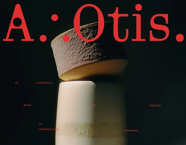
A homewares brand cover where a giant red serif 'A. Otis.' wordmark overlaps a dark moody photo of stacked textured ceramic vessels lit warmly from below.
Summary
A branding cover for a homewares maker that lets an oversized red serif wordmark, "A. Otis.", crash across a dark, warmly lit photograph of stacked textured ceramic vessels.
Visual description
The full frame is a near-black photo of two ceramic forms stacked: a rough, sandy-textured bowl resting upside-down on a smooth pale cylindrical vase, lit by a soft warm glow from the lower middle that rims the cream and tan surfaces against the shadow. Across the top, a huge red serif wordmark "A. Otis." spans nearly edge to edge, its bowl-shaped counters and dotted punctuation echoing the round vessels. The same deep red is reused at tiny scale for a scattered caption laid out across the lower half in widely spaced words: "AN EXPERIMENTAL / MAKER AND PURVEYOR / OF UNCONVENTIONAL HOMEWARES." placed in a loose grid rather than a tidy block.
Key takeaway
The single accent red doing double duty, a monumental wordmark up top and a constellation of micro-caption words below, ties type and product into one system. Letting the headline serif overlap the dark photo (no panel, no box) makes the type feel embedded in the scene.
Reuse notes
Reach for this on a product or maker brand where you have one strong, moody hero photograph to carry the whole frame. Best when the photo has deep shadow areas to drop the scattered caption into. Needs genuinely good photography; a flat or busy image would collapse the type-over-image trick.
More like this









Keep what you find
A free account saves references to boards and can send you a weekly email of picks based on what you save.
To see every result, go Pro.