Preview image. Unlock full-res
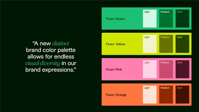
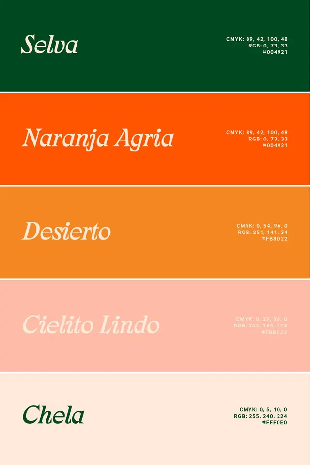
A stacked color palette specimen presents five horizontal swatches with elegant serif names and color values.
Summary
A stacked color palette specimen presents five horizontal swatches with elegant serif names and color values.
Visual description
Five horizontal color bands fill the canvas from top to bottom, separated by thin white dividers. Each band contains a large italic serif name on the left and small stacked CMYK, RGB, and hex values on the right. The palette moves from deep green to bright orange, soft peach, and a pale cream background.
Key takeaway
Use oversized elegant serif labels against bold solid swatches to make a palette feel editorial rather than utilitarian. Pair the color name with compact technical values to keep the composition both beautiful and practical.
Reuse notes
Reach for this format when presenting brand color systems, campaign palettes, or seasonal identity directions. It works best when the goal is quick visual impact with readable color metadata.