Preview image. Unlock full-res
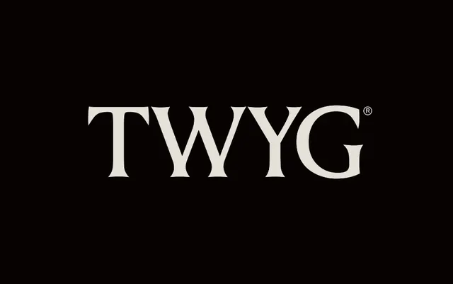
A four-letter TWYG wordmark in a high-contrast transitional serif, set in cream caps on black with a small registered-trademark symbol tucked above the final G.
Summary
The wordmark TWYG set in a high-contrast transitional serif, cream caps centered on a near-black field, finished with a small registered-trademark glyph above the final letter.
Visual description
Four capital letters, T W Y G, run horizontally across the center of a flat black canvas in a warm cream off-white. The face is a serif with pronounced thick-to-thin stroke modulation and crisp bracketed serifs; the W nests its two Vs tightly and the G carries a clean spur, reading classic and editorial rather than geometric. Letterspacing is even and generous, giving the short word weight and presence. A small circled R sits at upper right just past the G. There is no tagline, container, or secondary element; the type and the empty black are the whole composition.
Key takeaway
Treating a four-letter name as a luxury logotype: a single high-contrast serif in all caps, widely spaced on black, needs no icon to feel established. The tiny registered mark adds an air of pedigree for almost no visual cost.
Reuse notes
Suits fashion, beauty, spirits, or a heritage-leaning creative studio that wants understated authority. The warm cream rather than pure white softens the contrast and keeps it from feeling cold. Give it room: this mark depends on surrounding negative space, so avoid crowding it with supporting copy.
More like this

Keep what you find
A free account saves references to boards and can send you a weekly email of picks based on what you save.
To see every result, go Pro.