Preview image. Unlock full-res
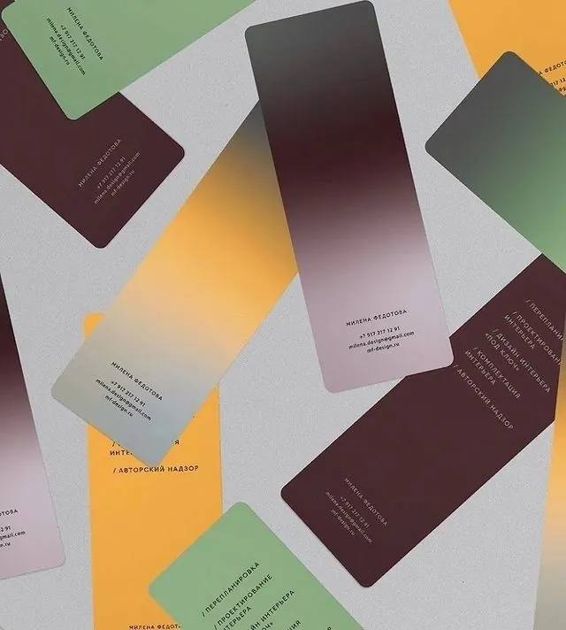
An overhead scatter of business cards for an interior-design studio, each face a soft amber-to-aubergine gradient with minimal Cyrillic type, on a gray surface.
Summary
An overhead flat-lay of tall business cards for an interior-design studio, scattered across a gray surface, each face printed with a soft gradient and small Cyrillic contact and service copy.
Visual description
A loose pile of narrow, portrait-format cards lies at angles on a light gray ground, photographed top-down. The card faces cycle through a small palette: sage green, mustard amber, and deep aubergine-brown, several rendered as smooth gradients that bleed amber into purple-brown or pale lilac into gray. Tiny light-weight Cyrillic type runs vertically and along the lower edge, listing a name, phone number, email, and a slash-separated service list. The mix of solid and gradient backs, overlapping at scattered rotations, gives a tactile stationery-mockup feel rather than a flat layout.
Key takeaway
A cohesive identity built from one tight palette applied as both flat fills and gradients across a single card format, so a stack reads as a coordinated set without a logo doing the work. The scattered overhead flat-lay is a quick, photogenic way to present a stationery system.
Reuse notes
Reference for an interior, architecture, or boutique-studio identity and for presenting a finished business-card system on a portfolio or case-study page. The gradient-on-card move signals craft and warmth; keep typography small and quiet so the color carries it. Cyrillic copy here means contact details are not legible to non-Cyrillic readers, swap to your own script. </content>
More like this



Keep what you find
A free account saves references to boards and can send you a weekly email of picks based on what you save.
To see every result, go Pro.