Preview image. Unlock full-res
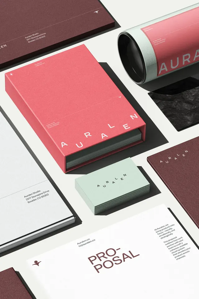
A cohesive branded stationery system pairing dusty rose, sage, and mauve printed items with coordinated typography and refined material treatment.
Summary
A branded identity system for AURALEN showcasing printed stationery and packaging arranged to highlight a coordinated color palette and refined material quality.
Visual description
An angled, isometric composition of branded collateral laid on a white surface. Featured items include a burgundy-mauve hardcover book with "AURALEN" spine text and fine print, a bright coral-rose flat folder with "AURALEN" in sans-serif, a cylindrical kraft tube labeled "AURALEN" in gray serif lettering, a sage-green business card stack, and complementary mauve-toned business cards. The typography alternates between crisp sans-serif and delicate serif display faces. Soft drop shadows and the diagonal arrangement create depth while the restricted palette of dusty rose, sage, mauve, charcoal, and cream unifies the suite across formats.
Key takeaway
The material layering and shadow treatment make 3D stationery mockups feel tangible. The restricted, warm-neutral palette (four colors across all items) creates brand cohesion without looking monolithic. The mix of serif (book spine, tube label) and sans-serif (folder, card) type shows how contrast within a tight vocabulary reads as intentional rather than scattered.
Reuse notes
Perfect for a luxury or editorial agency brand system, or any high-touch client work where material quality and print detail matter. The sage and dusty-rose pairing works especially well for lifestyle, nonprofits, or media brands. The composition itself is a strong mockup template for portfolio work. Note the charcoal text on cream and rose backgrounds ensures legibility across the palette.
More like this



Keep what you find
A free account saves references to boards and can send you a weekly email of picks based on what you save.
To see every result, go Pro.