Preview image. Unlock full-res
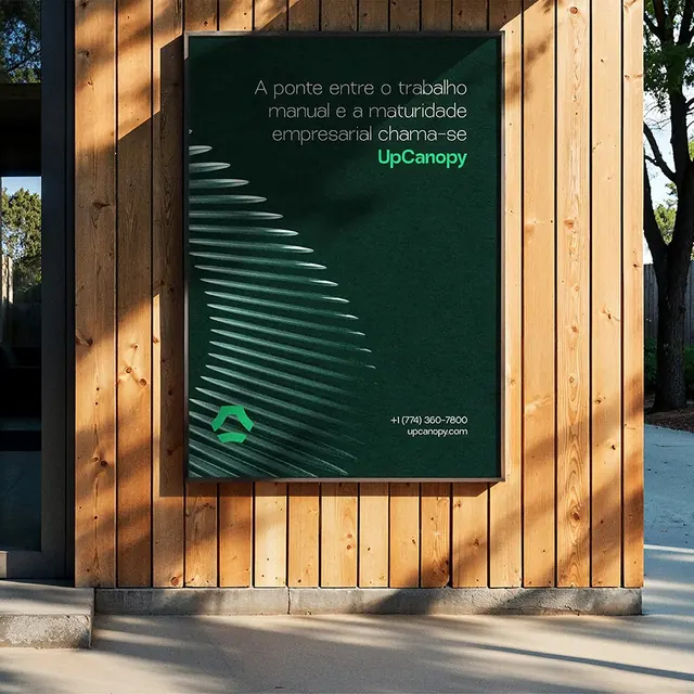
An outdoor mockup mounts a deep-green UpCanopy poster, fanned palm-frond graphic and Portuguese tagline, on a sunlit wood-slat building wall.
Summary
A real-world poster mockup: a portrait deep-green UpCanopy poster, with a soft fanned palm-frond illustration and Portuguese tagline, hangs in a recessed frame on a vertical wood-slat wall under raking daylight.
Visual description
The shot is a building exterior clad in warm vertical pine slats, lit by hard low sun that throws long diagonal shadows and silhouettes a tree at right. Centered in a routed wood frame is a portrait poster in dark forest green. White sans-serif copy reads "A ponte entre o trabalho manual e a maturidade empresarial chama-se" with the green wordmark "UpCanopy" picking out the brand name. A pale, finely lined palm-frond graphic fans across the left of the poster like an embossed leaf. A small green geometric logo mark sits bottom-left, with phone number and "upcanopy.com" bottom-right. The overall palette runs natural wood browns and tans against the deep green and an off-white type, grounded and calm.
Key takeaway
Show identity work in situ on a textured architectural surface so the brand reads as built and permanent rather than a flat artboard. The monochrome green poster with one delicate line-art frond does a lot with restraint, and letting the wordmark be the only color shift inside the headline is a clean way to brand a sentence.
Reuse notes
Use this presentation approach when pitching environmental or signage applications for a consulting, agency, or property brand. The wood-and-shadow context flatters earthy, natural palettes; a neon or tech identity would fight it. Keep poster copy short, the long Portuguese headline works because the type is generously spaced and the rest of the poster is quiet.
More like this




Keep what you find
A free account saves references to boards and can send you a weekly email of picks based on what you save.
To see every result, go Pro.