Preview image. Unlock full-res
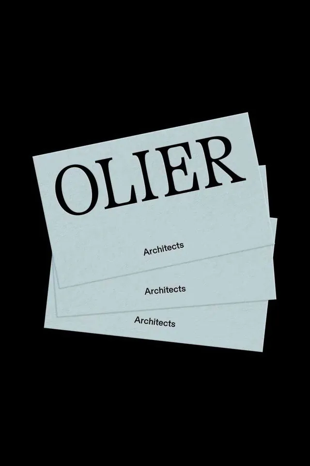
Fanned stack of pale-blue Olier Architects cards on black, pairing a serif display wordmark with a small sans-serif label in a high-contrast print mockup.
Summary
A stationery mockup for "OLIER Architects" showing three pale-blue cards fanned in a stack on a black background, anchored by an oversized high-contrast serif wordmark.
Visual description
Three identical cards in a soft, slightly textured pale blue-gray stock are stacked and fanned so each lower card's edge peeks out below the one above it. The top card dominates: "OLIER" set huge in a classical high-contrast serif (Didone-like, with hairline thins and bracketed serifs), filling the upper two-thirds of the card. Centered well below it, in small black sans-serif, sits the word "Architects", repeated on each visible card edge of the stack. The deep black backdrop isolates the cards and pushes their pale color and paper grain forward. The palette is restrained to near-white blue, mid-gray, and black.
Key takeaway
The scale jump between a monumental Didone display wordmark and a tiny quiet sans-serif label is the whole identity: maximum type contrast carries elegance with no graphics, color, or logo mark. Photographing the cards fanned on black turns a single layout into a tactile stationery system and sells the paper stock.
Reuse notes
Ideal for architecture, interiors, fashion, or any practice that wants understated luxury. The high-contrast serif demands a real display cut and crisp printing; at small sizes the hairlines will break. Pairs well with letterpress or uncoated textured stock and a muted single-color paper.
More like this



Keep what you find
A free account saves references to boards and can send you a weekly email of picks based on what you save.
To see every result, go Pro.