Preview image. Unlock full-res
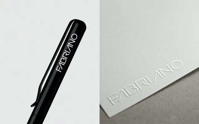
Monochromatic pen and paper product shot for Fabriano, showcasing minimalist serif type over split black and gray backgrounds.
Summary
A split-panel product shot of a luxury writing pen and paper business card, both embossed with "Fabriano" in elegant serif type, set against contrasting black and gray backgrounds.
Visual description
Left panel: a glossy black ballpoint pen tilted diagonally upward, with white serif letterforms spelling "FABRIANO" along its barrel. Right panel: a cream-colored rectangular card or sleeve with the same serif type embossed in a lighter gray, angled subtly. The composition isolates each object against a clean, neutral background to emphasize form, material quality, and typographic refinement. The monochromatic palette (black, white, cream, gray) and minimal geometry prioritize legibility and tactile elegance.
Key takeaway
The restrained split-composition technique isolates product and identity separately but as a single statement. The serif typeface choice signals heritage and craft. Embossing on the paper side creates a subtle tactile cue without color.
Reuse notes
Strong choice for premium pen, stationery, or paper goods branding. Works for any luxury product requiring quiet sophistication and legibility. Pair well with a single-color logo and a serif or didone face. The lack of color means it translates perfectly to black-and-white print and emboss applications.
More like this


Keep what you find
A free account saves references to boards and can send you a weekly email of picks based on what you save.
To see every result, go Pro.