Preview image. Unlock full-res
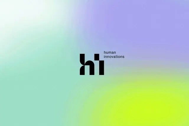
A bold black lowercase 'hi' monogram with 'human innovations' set small beside it, floating over a soft mesh gradient blending lavender, mint and acid lime.
Summary
A "Human Innovations" logo: a chunky black lowercase "hi" monogram with custom geometric letterforms, locked to a small two-line "human innovations" label and set against a smooth iridescent gradient of lavender, mint and acid-lime green.
Visual description
The background is a soft mesh gradient that drifts from a milky mint-white at the upper left into lavender-purple at the top right and pools into a glowing acid-lime green at the bottom right, with no hard edges. Slightly left of center sits the mark: a heavy black lowercase "hi" built from blocky, squared-off strokes where the dot of the "i" reads as a separate solid square, giving it a constructed, modular look. To the upper right of the monogram, the words "human" and "innovations" stack in a small, light, plain sans-serif. The black mark is the only high-contrast element and stays compact, letting the gradient occupy most of the frame.
Key takeaway
The contrast play: a single dense black geometric monogram dropped onto an airy multi-stop gradient reads as both modern-tech and calm at once. Building the "hi" from squared modular strokes (and treating the i-dot as a discrete block) is a cheap way to make two common letters feel proprietary.
Reuse notes
Good reference for an AI, tech, or innovation-consulting brand that wants softness and optimism without going corporate-grey. The gradient is the brand asset, so it needs to be reproducible as a flexible background across applications. Keep the monogram solid black for contrast, since the gradient is too light to carry a tinted mark.