Preview image. Unlock full-res
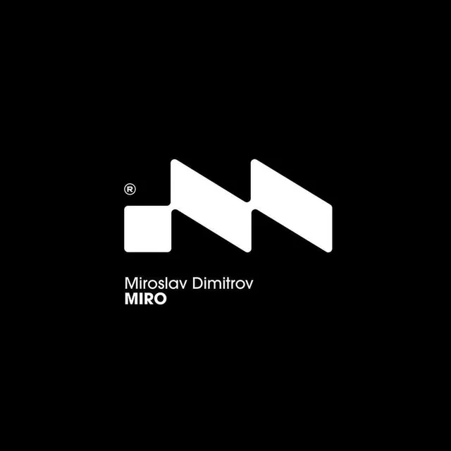
Personal-brand identity for Miroslav Dimitrov built on a chunky white zig-zag M monogram with a registered-trademark mark, set on solid black above a two-line name lockup.
Summary
A personal-brand monogram for Miroslav Dimitrov: a heavy white M built from offset rectangular blocks that read as a stepped zig-zag, sitting on a pure-black field above the name.
Visual description
The mark is a solid white M constructed from thick angular bars with softly rounded corners, sheared into a parallelogram silhouette so the strokes step diagonally up and to the right like a stylized lightning bolt or stacked terraces. A small superscript registered-trademark symbol floats to the upper left of the mark. Below, left-aligned to the mark's left edge, sits a two-line lockup: "Miroslav Dimitrov" in a light-weight sans-serif and "MIRO" in bold all-caps beneath it. Everything is white on a full-bleed black background with generous empty space framing the mark.
Key takeaway
Build a letter-mark out of repeated offset blocks rather than drawn strokes, so the same geometric unit makes the whole letter and the negative-space gaps become part of the form. Pairing a light full-name line directly over a bold short-form line gives one lockup that works as both a formal credit and a punchy logotype.
Reuse notes
Strong template for a designer or studio personal mark where the initial carries the brand. The blocky construction stays legible at small sizes and inverts cleanly to black-on-white. Needs the surrounding black space to feel premium; on busy backgrounds the stepped silhouette can read as ambiguous.