Preview image. Unlock full-res
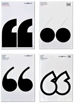
A four-cover catalog series that crops giant black quotation marks across white pages, varying the glyph treatment per category while keeping a fixed corner-text grid.
Summary
A 2x2 set of catalog covers for a Frankfurt foreign-rights program, each built around an enormous black quotation mark cropped to fill the white page. The single idea is one glyph, drawn four different ways, doing all the work.
Visual description
Four portrait covers share a strict grid: a small "Grupo Planeta" lockup top-left, a section number badge top-right, and a few lines of category text set tight in the upper corners. The lower two thirds of each cover is given over to a massive solid-black quotation mark, but the glyph changes per cover, a stencil-cut pair of slabs, two filled dots dropping thin tails, a smooth conventional curly quote, and a hybrid leaf-and-comma form. Everything sits on flat white with no imagery or color, so the contrast between the tiny corner type and the giant mark carries the hierarchy.
Key takeaway
Take one symbol and redraw it several ways to generate a whole cover series without changing the layout grid. The fixed corner-text system plus a numbered badge keeps the set legibly related even as the hero glyph mutates from stencil to script.
Reuse notes
Strong template for a multi-volume publication, report series, or event collateral where you need visual variety across many covers but one recognizable system. Works best in pure black on white where the cropped glyph reads as a graphic shape. Needs a symbol with enough drawable variants to sustain the series.
More like this





Keep what you find
A free account saves references to boards and can send you a weekly email of picks based on what you save.
To see every result, go Pro.