Preview image. Unlock full-res
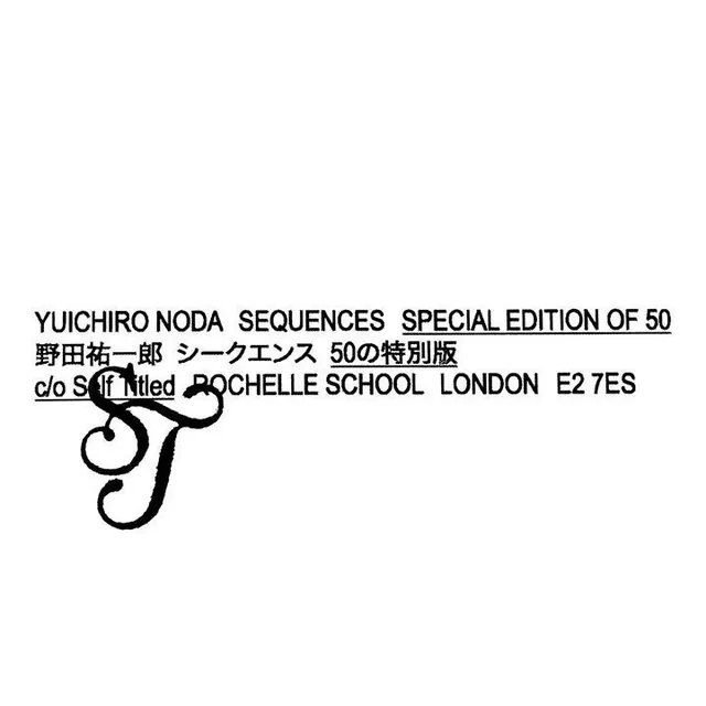
A black-on-white exhibition credit for Yuichiro Noda's Sequences sets bilingual English and Japanese lines in a rough stamped grotesque, overlapped by a large ornate calligraphic monogram.
Summary
A black-on-white exhibition credit set as three centered text lines, "YUICHIRO NODA SEQUENCES SPECIAL EDITION OF 50" with a Japanese translation and a London gallery address, partly overlapped by an oversized ornate swash monogram. The collision of plain industrial type and a flourished initial is the whole idea.
Visual description
Pure white field with the type block sitting low-center. Three lines run in a slightly roughened, stamped-looking bold grotesque: the English title with one phrase underlined, the Japanese rendering directly beneath, then a credit and London postal address ("c/o Self Titled, ROCHELLE SCHOOL, LONDON E2 7ES"). Underneath and overlapping the bottom line is a large decorative calligraphic monogram in a contrasting script, its tails crossing over the printed letters so the two layers visibly interfere. The inked edges give a letterpress or rubber-stamp texture rather than a crisp digital print.
Key takeaway
The deliberate overprint: an ornate script monogram set large and allowed to collide with a flat sans-serif credit line, so the two type registers clash on purpose. Stacking English over Japanese over an address turns dry catalog metadata into the entire composition.
Reuse notes
Useful for art-edition stamps, exhibition collateral, or limited-run product credits where you want a handmade, archival feel. Pairs a workhorse grotesque with one expressive display glyph. Caveat: the overlap reduces legibility of the script initial, so keep the factual lines clean and let only the decorative layer break the grid.
More like this







Keep what you find
A free account saves references to boards and can send you a weekly email of picks based on what you save.
To see every result, go Pro.