Preview image. Unlock full-res
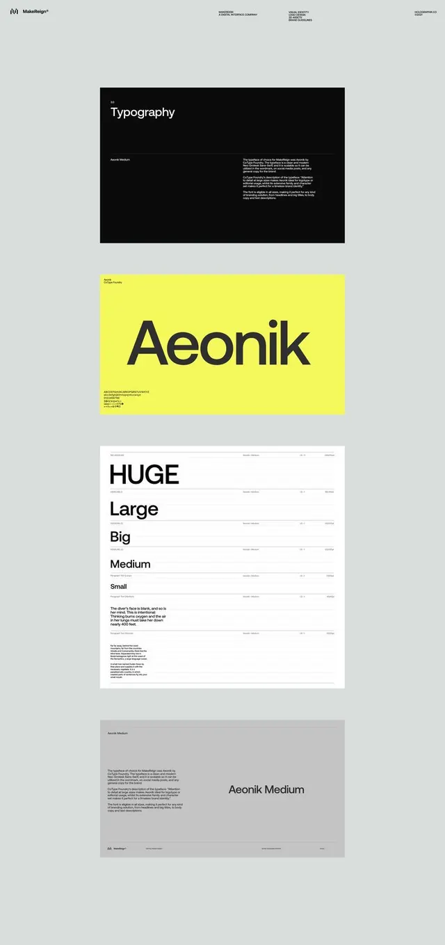
Four stacked brand-guideline typography panels for a digital agency, pairing a black cover, a chartreuse Aeonik display sheet, and a white type-scale ladder from HUGE to Small.
Summary
Four sequential typography pages from a brand guideline, anchored by a chartreuse display sheet showing the Aeonik wordmark and a ruled type-scale ladder running HUGE, Large, Big, Medium, Small.
Visual description
On a light grey backdrop, four portrait panels stack vertically with a tiny running header across the top of the first. The opening panel is solid black with white text, a small "3.0" eyebrow above the word "Typography" and two columns of fine caption copy. The second panel is a saturated chartreuse square with the word "Aeonik" set huge in dark grey, a character-set glyph string beneath it. The third is a white sheet ruled with thin horizontal lines into a type-scale table: oversized specimens (HUGE, Large, Big, Medium, Small) on the left, each row tagged with weight and leading values on the right. The closing panel is mid-grey with the "Aeonik Medium" label set large alongside small paragraph copy and a footer bar.
Key takeaway
The ruled type-scale table that pairs each oversized specimen with its exact size, weight, and leading labels in a right-hand spec column. The single chartreuse panel inserted between neutral pages does all the energy work without color elsewhere.
Reuse notes
A strong template for the typography section of any brand or design-system document. The thin-rule spec table reads as rigorous and is easy to reproduce in a guideline deck. Reserve the bright accent for one hero spread so the rest stays calm.
More like this




Keep what you find
A free account saves references to boards and can send you a weekly email of picks based on what you save.
To see every result, go Pro.