Preview image. Unlock full-res
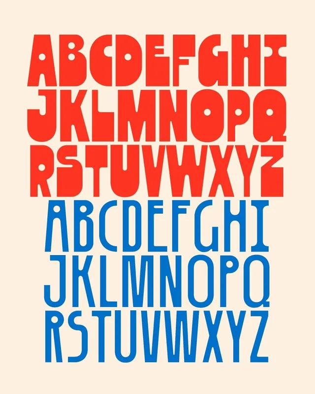
A two-weight display typeface specimen showing the full A-to-Z alphabet first as a heavy rounded red set, then as a tall narrow blue set, both on cream.
Summary
A display-typeface specimen contrasting two cuts of the same uppercase alphabet: a fat, super-rounded red version up top and a tall, condensed blue version below, both set against a warm cream ground.
Visual description
The top block runs A to Z over three lines in bright red, with extremely heavy, almost bulbous letterforms, tight counters, and rounded corners that recall 1970s display lettering. The lower block repeats A to Z in a vivid mid blue, but the cut is the opposite: narrow, elongated, lighter in weight with open counters and pointed apexes. Letters are packed edge to edge with minimal spacing so each alphabet reads as a solid color field. No body copy or sample words appear; the specimen is purely the glyph set in two contrasting weights on cream.
Key takeaway
Show a typeface's range by pairing its heaviest and most condensed cuts as full alphabet blocks in two clashing brand colors, letting the silhouette difference do the demonstrating. Set the letters edge to edge so each weight reads first as a colored shape and second as legible characters.
Reuse notes
A clean template for type foundries, brand type pages, or poster lockups that want to flaunt a display family's extremes. The packed all-caps treatment is for headlines and identity, not text. The red and blue on cream is a strong retro pairing; swap colors to re-theme while keeping the two-weight comparison structure.
More like this


Keep what you find
A free account saves references to boards and can send you a weekly email of picks based on what you save.
To see every result, go Pro.