Preview image. Unlock full-res
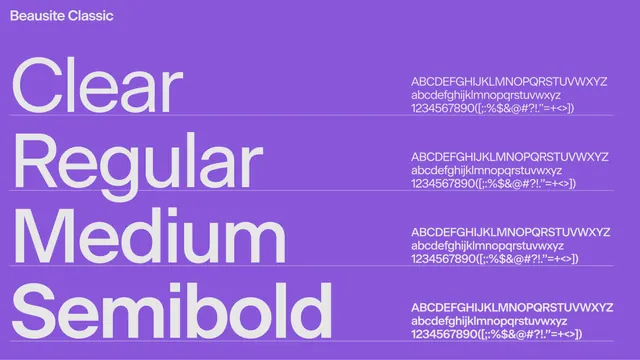
A type specimen for Beausite Classic on a flat purple ground, stacking four weights as large white labels beside their full glyph sets.
Summary
A clean weight-comparison specimen for the grotesque sans Beausite Classic, set in white on a single flat purple field with the foundry name pinned to the top-left.
Visual description
A solid medium-purple background fills the frame. The typeface name Beausite Classic sits small in the top-left corner. The left two-thirds stack four large white sample words, one per weight, reading Clear, Regular, Medium and Semibold from top to bottom, each set in its own weight so the increasing stroke thickness is the comparison. The right third repeats, for each weight, a compact white block of the full uppercase and lowercase alphabet plus numerals and punctuation. The layout is a simple two-column grid with even vertical rhythm and generous letter scale; no color beyond the purple ground and white type.
Key takeaway
Using the weight names themselves as the display words, each rendered in that weight, so the specimen demonstrates and labels in a single line. Pairing each big sample with a small full-character block on the right gives reviewers everything they need without a second page.
Reuse notes
A reusable layout for any type specimen slide or brand type page where you need to show a family's weights fast. The flat saturated ground keeps focus on the letterforms; swap the purple for a brand color. Best when the family has clearly distinct weights worth comparing.
More like this





Keep what you find
A free account saves references to boards and can send you a weekly email of picks based on what you save.
To see every result, go Pro.