Preview image. Unlock full-res
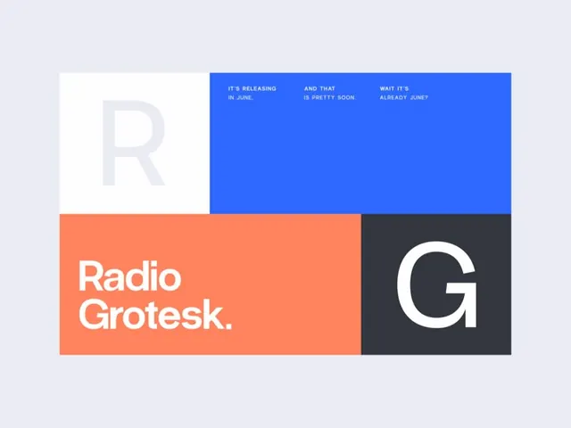
A Swiss-style color-blocked layout promoting the Radio Grotesk typeface, splitting white, blue, coral, and charcoal panels around large R and G letters.
Summary
A promotional artboard for the Radio Grotesk typeface, built from four flat rectangular panels (white, royal blue, coral, charcoal) that frame an oversized grey R, a white G, and the wordmark Radio Grotesk.
Visual description
The layout sits on a pale lilac ground and divides into a tidy grid of color blocks. Top-left, a white panel holds a giant light-grey capital R. To its right a royal-blue band carries three short lines of small white all-caps copy reading like a playful release teaser (IT'S RELEASING IN JUNE / AND THAT IS PRETTY SOON / WAIT IT'S ALREADY JUNE). The bottom-left coral block sets Radio Grotesk. in clean white lowercase with a period, and the bottom-right charcoal block frames a large white capital G. The four blocks lock together edge to edge, using scale contrast between the tiny grid copy and the display letters to carry the hierarchy.
Key takeaway
Using two oversized opening and closing letters (R and G) as graphic anchors in opposite corners bookends the layout and spells the initials without a logo. Color-blocking the grid so each panel owns one message keeps a type promo from feeling like a wall of specimen text. The conversational micro-copy in the blue panel adds personality to an otherwise formal Swiss grid.
Reuse notes
A clean model for announcing a typeface, product, or release where you want to show the type doing the talking. The blue-coral-charcoal split is punchy and reads well on social or as a landing hero. Swap the giant letters for any brand initials; keep the strict edge-to-edge block grid, since the impact depends on the panels meeting cleanly with no gutters.
More like this


Keep what you find
A free account saves references to boards and can send you a weekly email of picks based on what you save.
To see every result, go Pro.