Preview image. Unlock full-res
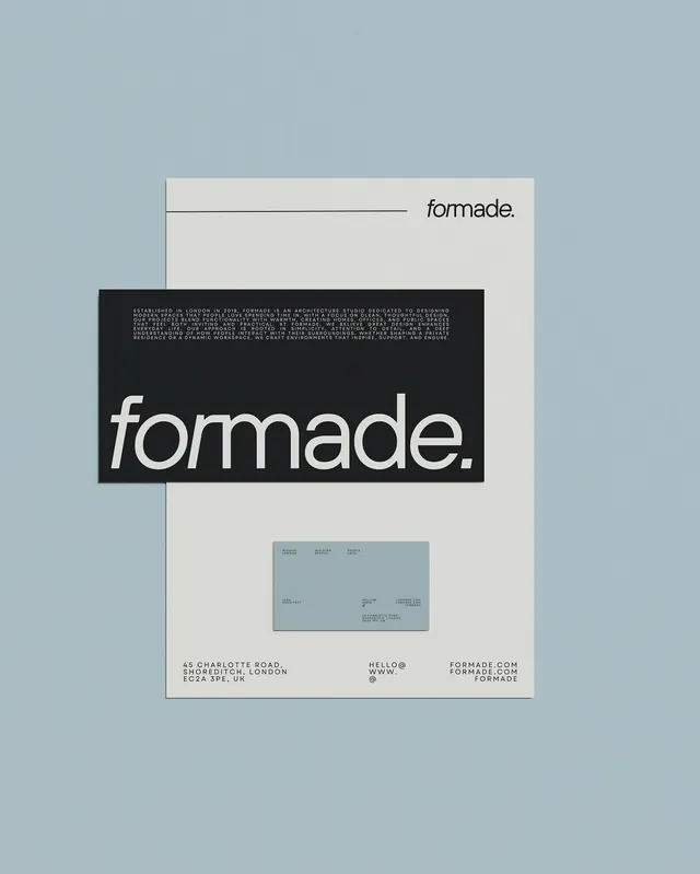
A layered stationery mockup showing an architecture studio brand with uppercase italic logotype set against a black rectangular overlay on cream card stock.
Summary
A layered stationery system for an architecture studio, pairing cream card stock with a black rectangular band emphasizing the italic sans-serif logotype and dense contact information below.
Visual description
The mockup displays three overlapping pieces: a pale blue background plane, cream card stock in the upper layer, and a bold black rectangle inset lower-left that holds the primary logotype and a block of white typographic details. The logotype reads "formade." in elegant italic sans-serif, large and prominent. Below it sits dense, justified body text in a smaller sans-serif detailing the studio's address in London and contact information. A horizontal line accent extends from above the logotype. The composition uses asymmetric vertical alignment and deliberate whitespace on the cream ground to balance the heavy black block.
Key takeaway
The italic sans-serif logotype against full-bleed black creates sharp figure-ground separation and memorability. Layering three distinct planes (blue ground, cream card, black block) uses depth to organize information hierarchy without decorative elements. The dense justified text on black provides a professional, detailed counterweight to the open cream field.
Reuse notes
Ideal for design studios, architects, and cultural agencies that need formal, refined branding. The color palette (dusty blue, cream, black) reads sophisticated and restrained. Works particularly well in applications where contact and service information needs to be prominent but secondary to the logo; the black band technique compartmentalizes this naturally.
More like this





Keep what you find
A free account saves references to boards and can send you a weekly email of picks based on what you save.
To see every result, go Pro.